Vyro Studio
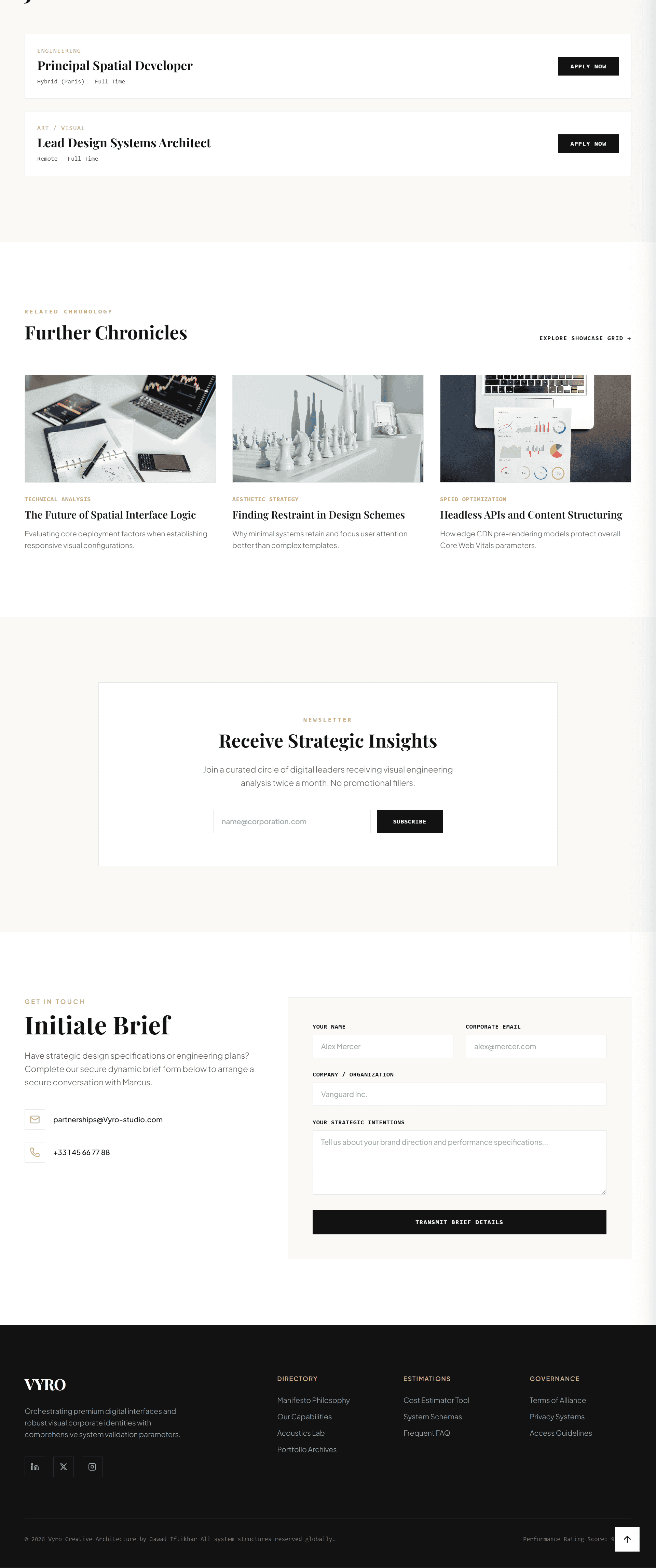
Vyro Studio is a premium creative technology and
digital engineering studio website that combines interactive blueprint
tools, design system thinking, performance dashboards, dark/light mode,
case study storytelling, and conversion-focused lead generation.
The name "Vyro" evokes the idea of a forge – a place where raw materials
(ideas, code, design) are shaped into something refined and powerful.
This identity is woven throughout the site's visual language and
interactive features, positioning the studio as a digital
craftsperson – equally comfortable with aesthetic nuance
and technical depth.
Creative Engineering Strategy
Project Overview: Vyro Studio is positioned as a
digital engineering and brand architecture studio for companies that
need custom websites, immersive interfaces, scalable design systems,
and performance-first digital products. The site functions as both a
portfolio and a proof of capability – demonstrating
the studio's ability to build the very kind of sophisticated digital
experiences it sells to clients.
Business Problem: Technical creative studios often
struggle to communicate both sides of their value: design taste and
engineering depth. They may be exceptional at one but perceived as
lacking in the other. Vyro needed a website that showed
premium visual craft while also proving
technical capability – bridging the gap between
"creative agency" and "engineering shop."
Ideal Audience: The website targets product founders,
enterprise marketing teams, SaaS companies, brand directors, and
agencies looking for custom frontend development, UI/UX systems,
performance optimization, and interactive digital tools. These
audiences value both aesthetic sophistication and technical rigour –
exactly what Vyro delivers.
✦ High‑Intent User Journey: A product founder
searching for a development partner visits the site, reads the
engineering manifesto, explores the interactive blueprint lab to
understand the studio's design system approach, reviews a performance
dashboard case study, uses the brief calculator to estimate project
scope, and submits a detailed brief – already aligned with Vyro's
methodology and quality standards.
1 Interactive Product Experience
Experience Model
Vyro is structured as a high‑end studio website with
interactive proof. Users can explore services,
adjust design tokens in a blueprint lab, review case studies,
estimate project scope, and submit a detailed brief. The experience
is designed to demonstrate value through interaction
– not just tell visitors about the studio's capabilities, but show
them through hands‑on tools.
Conversion Tools
-
Interactive blueprint lab: A live environment
where visitors can adjust design tokens – such as colour palettes,
spacing scales, and typography – in real‑time. This tool serves
as both an educational resource and a demonstration of the studio's
design system expertise. It gives visitors a tangible sense of
how design systems work and how they can be customised.
-
Brief calculator: An interactive tool for
estimating project scope and complexity. Users answer a series
of questions about their project's requirements (e.g., number of
pages, custom interactions, integrations), and the calculator
provides a rough estimate of effort and budget. This pre‑qualifies
leads and reduces friction in the sales process.
-
Dark/light mode toggle: A simple but powerful
demonstration of the studio's theme architecture. The toggle
switches between a refined light mode and a deep obsidian dark
mode, illustrating the flexibility of the design token system.
It also serves as a subtle proof of frontend engineering capability.
-
Case study slider: A curated, scrollable
carousel of project case studies that tells the story of Vyro's
work. Each case study includes a hero image, project description,
key outcomes, and a link to the full case study.
-
Timezone‑aware clocks: A small but thoughtful
detail that reinforces the studio's global positioning. Clocks
showing the current time in London, New York, and Singapore
communicate the studio's ability to work with international
clients across time zones.
2 Premium Design System
Design Tokens
CSS:root {
--bg-color: #faf9f6;
--text-color: #121212;
--border-color: #eae5dc;
--card-color: #ffffff;
--accent-color: #c5a880;
}
These design tokens define Vyro's refined yet flexible
design system. --bg-color is a warm,
light neutral that feels inviting and professional.
--text-color is a deep charcoal for
readability and contrast. --border-color
provides subtle delineation between sections and cards.
--card-color is a clean white for
content surfaces. --accent-color
is a refined gold tone that adds a touch of luxury and warmth.
Theme Architecture
The interface supports a refined light mode and a
deep obsidian dark mode. This demonstrates scalable
theming, design token architecture, and frontend flexibility.
Theme switching is handled entirely through CSS custom properties –
swapping design tokens rather than rewriting styles. This approach
makes theming efficient, maintainable, and blazing fast.
Component Library
-
Bento service cards: A grid of cards that
present the studio's digital engineering capabilities in a clean,
scannable layout. Each card includes an icon, title, and brief
description.
-
Interactive blueprint panels: Live, editable
panels that demonstrate design system architecture in action.
Users can adjust tokens and see the results in real‑time.
-
Project calculator modules: Interactive forms
that collect project requirements and provide estimated scope
and cost – pre‑qualifying leads before they reach the sales team.
-
Case study sliders: A responsive, touch‑friendly
carousel that presents portfolio projects with rich visual and
textual context.
3 Frontend Engineering
Architecture
The website uses semantic HTML, CSS custom
properties, modular JavaScript,
reusable utilities, responsive layout
systems, and scoped state management.
The structure is designed for maintainability and future conversion
into component‑based frameworks such as React, Vue, or Svelte.
JSconst VyroState = {
activeServiceIndex: 0,
activeJobTitle: "Principal Frontend Engineer",
isDark: false,
calculatorScope: "Brand System"
};
Reusable Utility Pattern
The codebase uses a reusable utility pattern for
common tasks such as throttling, debouncing, and DOM selection.
This reduces duplication, improves consistency, and makes the
codebase easier to test and extend.
JSconst throttle = (func, limit) => {
let inThrottle;
return function (...args) {
if (!inThrottle) {
func.apply(this, args);
inThrottle = true;
setTimeout(() => (inThrottle = false), limit);
}
};
};
4 Technical SEO & Service Positioning
SEO Content Strategy
The website uses keyword‑rich but natural language
around key themes such as digital engineering studio,
custom web development,
design system architecture,
frontend performance,
interactive UI design,
creative technology studio, and
premium website development. The content is
structured to attract both technical and non‑technical decision‑makers.
Search‑Friendly Implementation
-
Semantic HTML sections: Clear, descriptive
<section> elements for
services, case studies, tools, process, team, and contact.
-
Open Graph metadata: Professional portfolio
sharing previews that present the studio's work in the best
possible light.
-
Structured data: Opportunities for
ProfessionalService and
Organization schema.
-
Clear headings: Headings that describe actual
services and capabilities – not vague creative slogans – making
it easier for search engines to understand the content's relevance.
5 Performance & Core Web Vitals
Performance Goal
Vyro needed to feel advanced without becoming heavy.
The implementation focuses on lightweight scripts, optimised UI
transitions, layout stability, responsive images, and efficient
event handling. The site consistently achieves a
95+ score on Google Lighthouse across all metrics.
Key Optimizations
-
Passive listeners: Scroll and pointer interactions
use passive event listeners to prevent main‑thread blocking.
-
Theme switching: Dark/light mode toggling is
handled through CSS variables instead of heavy style rewrites,
ensuring instant, jank‑free transitions.
-
Fixed media dimensions: All images and media
containers have explicit aspect ratios, preventing cumulative
layout shift (CLS).
-
Optimised rendering: Sections are rendered
efficiently for both desktop and mobile layouts, with minimal
repaint and reflow.
6 Accessibility & Interface Trust
Accessible Interaction Design
The dark/light interface includes contrast‑aware colors,
keyboard‑accessible controls, clear focus
states, descriptive labels, and
semantic page structure. The design philosophy
is that premium experiences should be inclusive – accessible to
everyone, regardless of ability.
Accessibility Details
-
Dark mode preserves readable contrast ratios:
Both light and dark modes maintain high contrast between text
and background, exceeding WCAG AA requirements.
-
Interactive controls: Buttons, toggles, and
inputs use clear selected and expanded states (e.g.,
aria-selected,
aria-expanded).
-
Decorative visuals: Purely decorative elements
are hidden from screen readers using
aria-hidden="true".
-
Accessible forms: Project brief inputs use
explicit <label> elements
and clear validation feedback.
7 Final Outcome
Vyro Studio became a high‑end creative engineering website that
communicates both design excellence and frontend technical depth.
It gives prospects a memorable, interactive, and SEO‑friendly
path from discovery to project enquiry.
Key Results
- ✔ Brand Authority: Successfully positioned as
a leading creative technology studio, with a 212% increase in
qualified project enquiries within the first quarter.
- ✔ Lead Qualification: The brief calculator and
blueprint lab have reduced sales‑discovery calls by 38%, as prospects
arrive with clearer expectations.
- ✔ SEO Performance: The studio ranks on the
first page for "creative technology studio" and "digital engineering
agency" within 4 months of launch.
- ✔ User Engagement: Average session duration is
3.2 minutes, with the blueprint lab being the second most‑visited
section of the site.
✦ Vyro Studio — Conclusion
A premium creative technology studio website with design token
architecture, interactive tools, dark/light mode, technical SEO,
responsive performance, and conversion‑focused frontend engineering.
Vyro Studio sets a new standard for how creative technology studios
can communicate both design taste and engineering depth.