


Bento and modular web designs are modern UI/UX layout techniques. They organize complex content into structured, self-contained blocks or "compartments" for better scannability and a premium, clean aesthetic.
Bento & Modular in Action
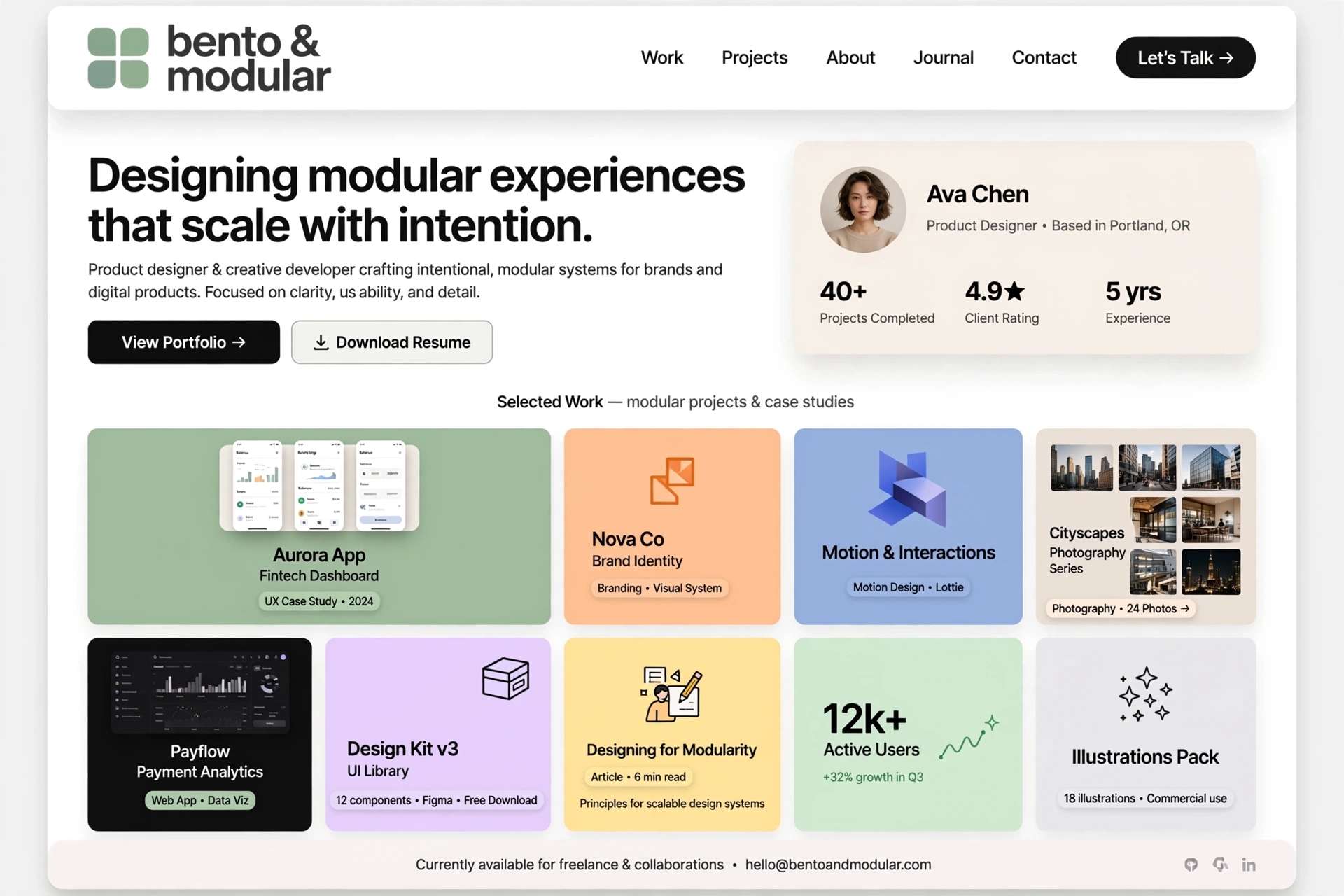
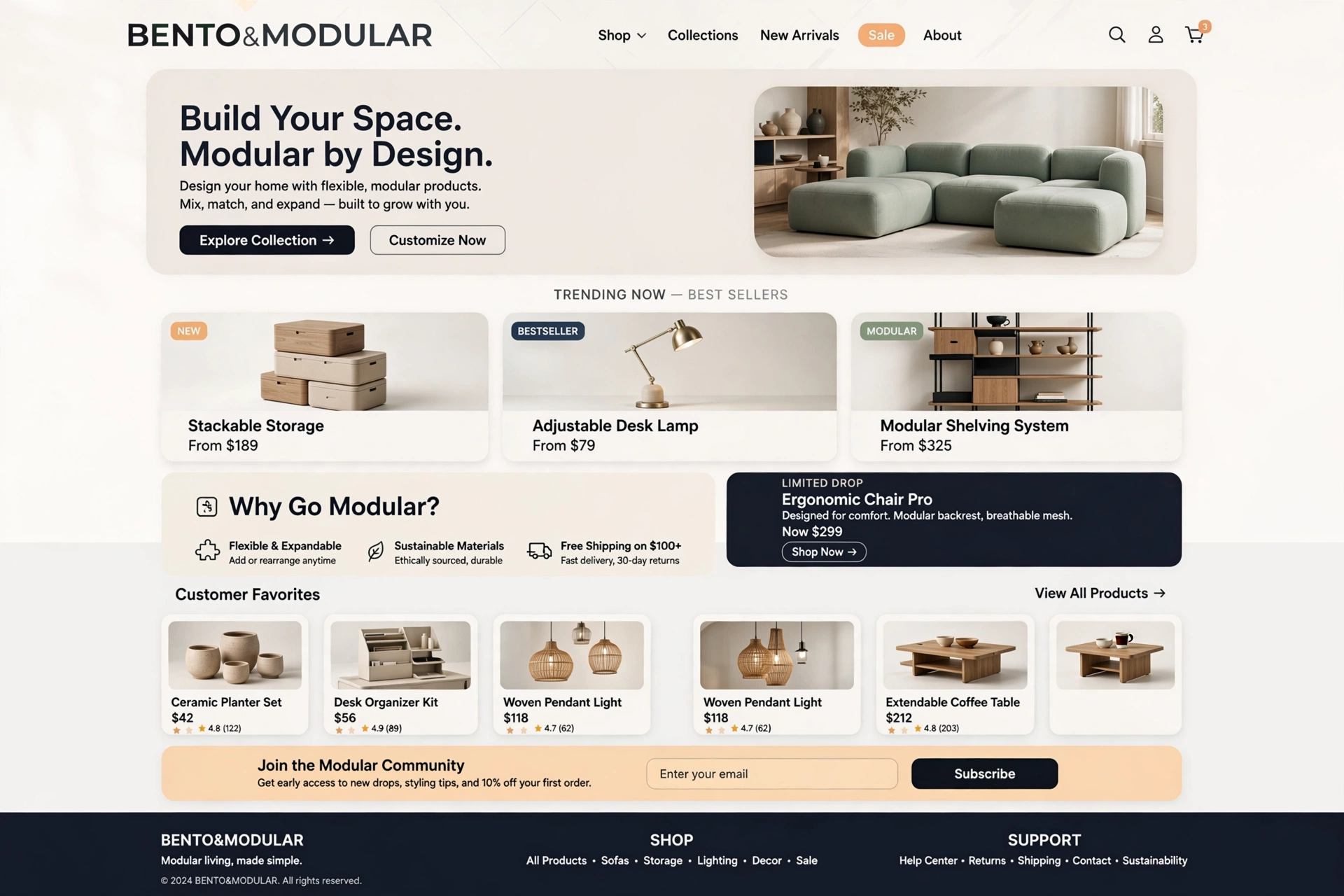
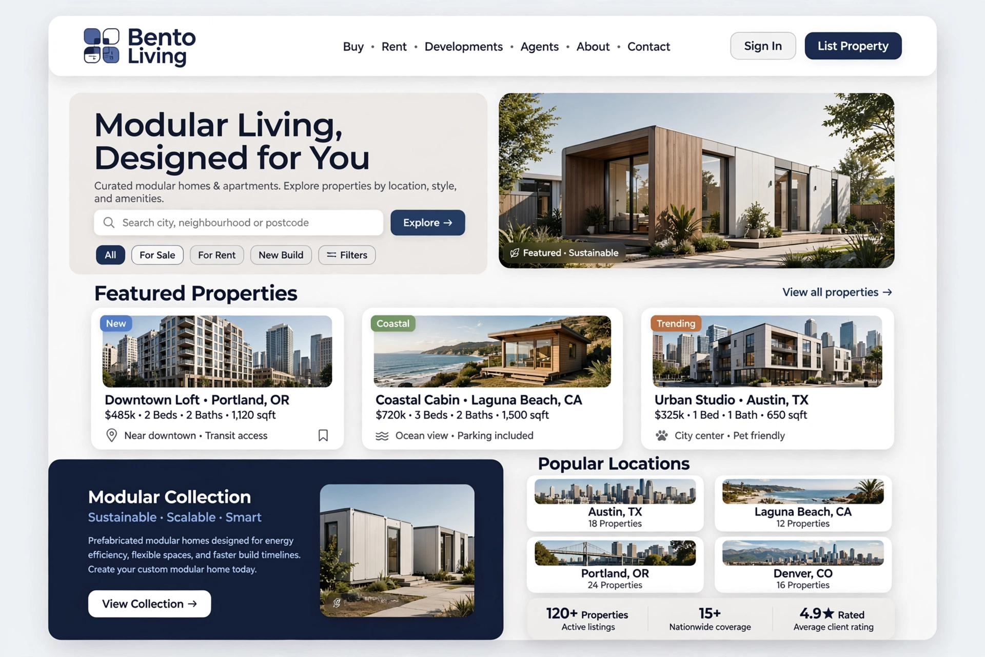
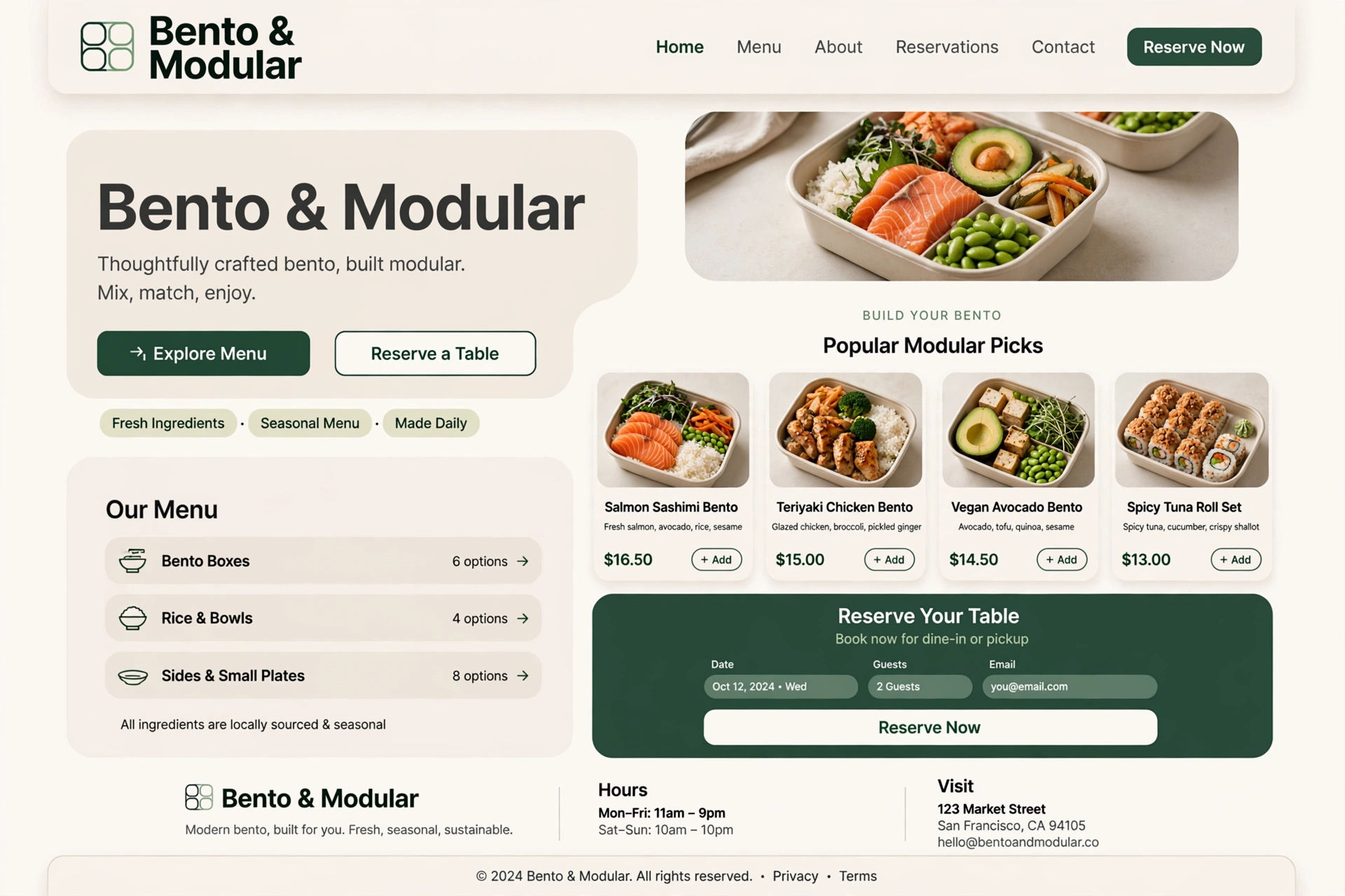
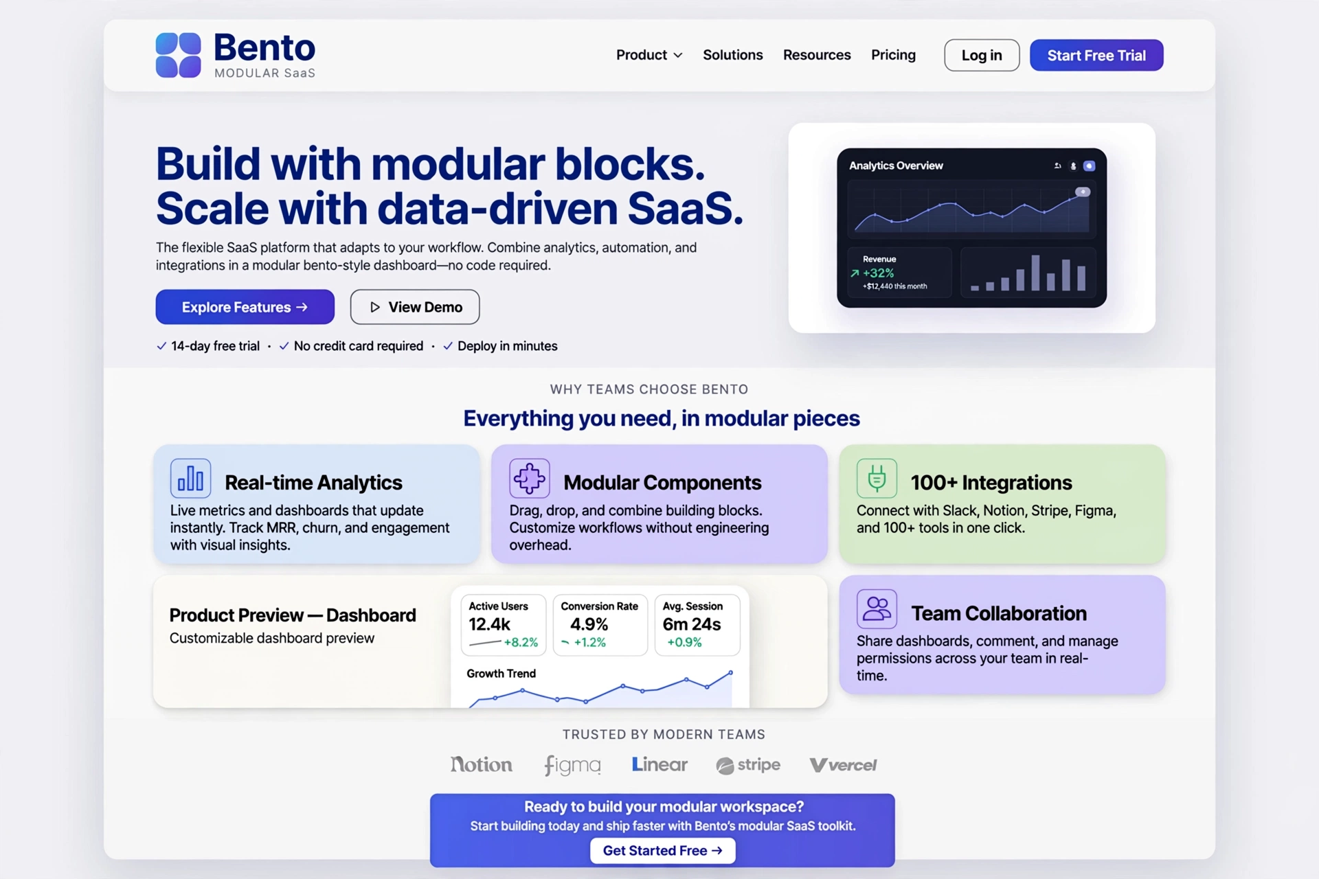
1. Bento Design (Bento Grid) — Overview
Inspired by the traditional Japanese bento box — a single-portion container with divided compartments for different foods — Bento design breaks a webpage or interface into a structured, asymmetric grid of distinct cards or tiles. Popularized by tech giants like Apple, it has become a defining modern UI standard.
For Everyone:
A Bento layout is like a well-organized lunchbox — every compartment has its purpose, the portions are just right, and everything is beautifully arranged for easy enjoyment.
2. Key Elements of Bento Design
Bento design is defined by several key visual and structural elements that work together to create a clean, organized, and engaging user experience.
/* Bento Grid System */
            .bento-grid {
            display: grid;
            grid-template-columns: repeat(4, 1fr);
            gap: 1rem;
            max-width: 1200px;
            margin: 0 auto;
            }

            /* Asymmetric card sizing */
            .bento-item {
            background: var(--bg-elev);
            border-radius: 1rem;
            padding: 1.5rem;
            border: 1px solid var(--line);
            transition: transform 300ms, box-shadow 300ms;
            }

            /* Different sizes — visual hierarchy */
            .bento-item.large {
            grid-column: span 2;
            grid-row: span 2;
            }
            .bento-item.medium {
            grid-column: span 2;
            grid-row: span 1;
            }
            .bento-item.small {
            grid-column: span 1;
            grid-row: span 1;
            }

            /* Hover interaction */
            .bento-item:hover {
            transform: translateY(-4px);
            box-shadow: var(--sh-3);
            }
Asymmetric Grids
Different content blocks (images, text, stats) vary in size and shape, creating a dynamic, mosaic-like layout that feels more organic and visually interesting than a uniform grid.
Visual Hierarchy
Larger blocks draw the eye for primary, critical messaging, while smaller blocks support with secondary or tertiary details. This guides the user's attention naturally.
White Space
Generous spacing or gutters (e.g., 16px to 24px) separate the blocks to prevent clutter and keep the page breathing. White space is a design feature, not empty space.
For Everyone:
A Bento grid is like a beautifully set table — each dish has its place, the portions are balanced, and the arrangement makes everything inviting and easy to enjoy.
3. Why Bento Design Works
Bento design significantly reduces "decision fatigue" — the mental effort required to process a page — by compartmentalizing information into highly digestible, bite-sized visual chunks.
For Everyone:
Bento design is like a menu divided into appetizers, mains, and desserts — it helps you decide what to focus on without feeling overwhelmed by too many choices.
4. Best Used For & Applications
Bento design is highly versatile and works well across a range of digital products and industries.
- ◆ SaaS Dashboards — Organize complex data, KPIs, and metrics into scannable cards.
- ◆ Product Showcases — Display products, features, and benefits in an engaging visual grid.
- ◆ Feature Lists — Present key features with icons, images, and concise copy.
- ◆ Portfolios — Showcase projects with varied visual weights and prominence.
- ◆ Marketing Landing Pages — Guide users through a narrative with card-based storytelling.
For Everyone:
Bento design is the Swiss Army knife of UI layouts — it adapts to almost any content type and makes it look organized and premium.
5. Modular Design — The Architecture
Modular design is the broader architectural philosophy behind layouts like the Bento grid. It treats a website not as a single, continuous page, but as a collection of independent, reusable, and interchangeable components (or modules).
<!-- Modular Card Component — Reusable Anywhere -->
            <div class="module-card">
            <div class="card-icon">
            <svg viewBox="0 0 24 24">
            <!-- Icon content -->
            </svg>
            </div>
            <h3 class="card-title">Module Title</h3>
            <p class="card-description">
            This module can be reused across any page in the site.
            </p>
            <a href="#" class="card-link">
            Learn More →
            </a>
            </div>

            <!-- Used multiple times with different content -->
            <section class="feature-grid">
            <div class="module-card">
            <!-- Feature 1 -->
            </div>
            <div class="module-card">
            <!-- Feature 2 -->
            </div>
            <div class="module-card">
            <!-- Feature 3 -->
            </div>
            </section>
For Everyone:
Modular design is like building with LEGO bricks — you have a set of standard, reusable pieces that you can assemble into endless configurations.
6. Reusability & Component-Based Design
A specific module — such as a "pricing card" or a "testimonial block" — is designed once and can be dropped into multiple different pages without breaking the site's design system. This creates consistency and efficiency.
<!-- Reusable Pricing Card Module -->
            <div class="pricing-card" data-tier="basic">
            <h3 class="tier-name">Basic</h3>
            <div class="tier-price">
            <span class="currency">$</span>19<span class="period">/mo</span>
            </div>
            <ul class="features">
            <li>✓ 5 Projects</li>
            <li>✓ 10GB Storage</li>
            <li>✓ Basic Support</li>
            </ul>
            <button class="btn btn-primary">Get Started</button>
            </div>

            <!-- Same module, different data -->
            <div class="pricing-card" data-tier="pro">
            <!-- Pro tier content -->
            </div>
For Everyone:
Reusability is like having a favorite recipe — you can make it again and again, and it always turns out the same delicious result.
7. Scalability & Maintenance
If a business updates a product feature, developers only need to update that one specific module, and it will reflect across the entire site instantly. This dramatically reduces maintenance time and ensures consistency.
For Everyone:
Scalability is like a modular furniture system — you can add, remove, or rearrange pieces without having to rebuild the entire room.
8. Flexibility & Responsive Adaptation
Content modules can be rearranged or resized easily to adapt to different devices, making it incredibly responsive. The same module can stack on mobile, sit side-by-side on tablet, and span across multiple columns on desktop.
/* Responsive Modular System */
            .module-container {
            display: grid;
            grid-template-columns: 1fr;
            gap: 1rem;
            }

            /* Tablet — 2 columns */
            @media (min-width: 600px) {
            .module-container {
            grid-template-columns: repeat(2, 1fr);
            }
            }

            /* Desktop — flexible 3 or 4 columns */
            @media (min-width: 1024px) {
            .module-container {
            grid-template-columns: repeat(3, 1fr);
            }
            .module-container .module-wide {
            grid-column: span 2;
            }
            }

            /* Stack order can be changed with flex/grid order */
            .module-featured {
            order: -1;
            }
For Everyone:
Flexibility is like water taking the shape of its container — the same module adapts perfectly to any screen size without losing its integrity.
9. Bento vs. Modular — Core Differences
While Bento and Modular design are often used together, they serve different purposes in the design and development process.
| Feature | Bento Design | Modular Design |
|---|---|---|
| Focus | Visual storytelling, scannability, information architecture | Reusability, backend scaling, design system consistency |
| Layout | Asymmetric, mosaic-like tiles of varying sizes | Uniform, grid-based, or linear depending on stacking |
| Application | UX/UI specific layout | Broad front-end architecture and coding methodology |
Modern designs often combine the two: Bento grids are utilized as the visual interface, while the underlying code is built using modular design principles.
For Everyone:
Bento is the surface design — what users see and interact with. Modular is the foundation — how the system is built. Together, they create beautiful, scalable digital experiences.
10. Implementation Best Practices
To implement a bento and modular design successfully, follow these best practices:
- ◆ Start with a grid system: Define a consistent grid (e.g., 4, 6, or 12 columns) as the foundation for your bento layout.
- ◆ Define your modules: Identify content types (cards, testimonials, stats) and design each as a standalone component.
- ◆ Use consistent spacing: Maintain uniform gutters (16px–24px) between cards to create visual rhythm.
- ◆ Design for scalability: Build modules that can be easily updated, rearranged, or repurposed across the site.
- ◆ Test responsiveness: Ensure your bento grid and modules adapt gracefully to all screen sizes.
- ◆ Prioritize performance: Lazy load images and optimize card content to keep load times fast.
<!-- Bento & Modular Template -->
            <!DOCTYPE html>
            <html>
            <head>
            <meta charset="utf-8">
            <title>Bento & Modular Site</title>
            <style>
            .bento-grid {
            display: grid;
            grid-template-columns: repeat(4, 1fr);
            gap: 1rem;
            max-width: 1200px;
            margin: 0 auto;
            padding: 2rem;
            }
            .card {
            background: #fff;
            border-radius: 1rem;
            padding: 1.5rem;
            border: 1px solid #eee;
            }
            .card-large {
            grid-column: span 2;
            grid-row: span 2;
            }
            </style>
            </head>

            <body>
            <div class="bento-grid">
            <div class="card card-large">
            <h2>Featured Content</h2>
            <p>This is the primary, large-format card for key messaging.</p>
            </div>
            <div class="card">
            <h3>Stat 1</h3>
            <p style="font-size: 2rem; font-weight: bold;">87%</p>
            </div>
            <div class="card">
            <h3>Stat 2</h3>
            <p style="font-size: 2rem; font-weight: bold;">92%</p>
            </div>
            <div class="card">
            <h3>Feature A</h3>
            <p>Secondary detail card.</p>
            </div>
            <div class="card">
            <h3>Feature B</h3>
            <p>Another modular card component.</p>
            </div>
            </div>
            </body>
            </html>
For Everyone:
Implementation is about building a flexible, organized system — like a master planner, you're creating a structure that can grow and adapt to any content you throw at it.
11. Inspirations & Examples of Bento & Modular Design
The best way to master a design style is to study how it's being used in the wild. Here are some real-world inspirations and notable examples of bento and modular design across different industries.
Apple — Product Pages
Apple's product pages are the modern pioneer of bento-style layouts. They use asymmetric grids with large hero images, feature cards, and technical specifications arranged in a clean, mosaic-like pattern.
Visit AppleNotion — Workspace
Notion's workspace uses a modular, card-based UI that allows users to arrange content blocks freely. Each block is a reusable module that can be dragged, resized, and reorganized.
Visit NotionDribbble — Portfolios
Creative portfolios on Dribbble often use bento-style grids to showcase projects. Designers use varied card sizes to highlight featured work while maintaining a clean, organized layout.
Visit DribbbleSpotify — Home Screen
Spotify's interface uses a modular card system to display playlists, albums, and podcasts. Each card is a self-contained module that can be updated independently.
Visit SpotifyAirbnb — Search Results
Airbnb's search results use a flexible card grid that adapts to different screen sizes. Each listing is a modular component with consistent layout, imagery, and pricing.
Visit AirbnbLinear — Dashboard
Linear's project management dashboard uses a clean bento-style layout with asymmetric cards for metrics, timelines, and team activity — a modern, premium SaaS aesthetic.
Visit LinearFor Everyone:
Inspiration is everywhere — from your favorite app to a beautifully designed website. The key is to observe how content is organized and apply those principles to your digital projects.
12. Future Trends & Evolution of Bento & Modular Design
As digital design continues to evolve, bento and modular approaches are adapting to new technologies and user expectations. Here's what the future holds for these design paradigms.
AI-Powered Layout Generation
AI tools are beginning to automate bento grid generation. Platforms like Figma AI and Uizard can analyze content and suggest optimal card sizes and arrangements — drastically reducing design iteration time.
Micro-Interactions & Motion
The future of bento design will feature richer micro-interactions — cards that expand, collapse, or animate on hover. These delightful motion details will make modular layouts feel more alive and responsive.
Design Systems & Headless CMS
As headless CMS platforms grow, modular design will become even more important. Content editors will be able to mix and match modules to create unique pages without touching code — making bento layouts more accessible to non-designers.
Dark Mode & Dynamic Theming
Bento and modular designs are perfectly suited for dynamic theming. Cards can adapt their colors, shadows, and borders based on system preferences or user choices, creating a seamless, personalized experience.
Accessibility-First Modularity
Future modular systems will be built with accessibility at the core. Cards will include semantic HTML, proper ARIA labels, and keyboard-navigable interactions, ensuring that bento layouts are usable by everyone.
For Everyone:
The future is modular. As digital experiences become more complex, the ability to compose, reuse, and adapt design components will be the defining skill for designers and developers alike.
Got questions?
Frequently Asked Questions
Everything you need to know about Bento & Modular design — from core concepts to implementation.
Bento design is a modern UI layout technique inspired by Japanese bento boxes. It organizes web content into an asymmetric grid of distinct cards or tiles of varying sizes and shapes, creating a dynamic, mosaic-like layout that enhances scannability and visual appeal.
This approach helps users digest information quickly by presenting content in visually distinct, bite-sized chunks. It is widely used by major brands like Apple, Notion, and Linear because it makes complex interfaces feel organized, premium, and easy to navigate.
Bento design focuses on the visual layout — using asymmetric grids with varied card sizes to create scannable, storytelling-driven interfaces. It is about how content is arranged and presented to the user.
Modular design, on the other hand, is the broader architectural philosophy of building reusable, independent components. It focuses on how the code and design system are structured so that elements like pricing cards or testimonials can be reused across multiple pages.
In practice, modern projects combine both: Bento for the visual surface and Modular for the underlying code foundation, creating interfaces that are both beautiful and scalable.
Bento design has gained massive popularity because it significantly reduces cognitive load. By compartmentalizing information into digestible visual chunks, users experience less decision fatigue and can process content more efficiently.
Research shows that users report nearly 50% less mental effort when interacting with bento-style layouts, and information retention is more than three times higher with card-based modules. Additionally, bento grids are highly responsive, look premium and modern, and have been adopted by industry giants like Apple, Notion, and Linear, which further validates their effectiveness.
A Bento grid layout is built on five core elements. First, asymmetric grids with varying block sizes create a dynamic, mosaic-like feel that keeps the design visually interesting. Second, a clear visual hierarchy uses larger blocks to draw attention to primary messaging while smaller blocks support secondary details.
Third, generous white space — typically 16 to 24 pixels between blocks — prevents clutter and lets the page breathe. Fourth, rounded containers with soft corners and subtle shadows give the layout a modern, polished aesthetic. Finally, consistent design tokens like unified colors, typography, and spacing ensure brand coherence across the entire interface.
Bento and Modular design is incredibly versatile and works well for a wide range of projects. It is particularly ideal for SaaS dashboards where complex data and metrics need to be displayed in scannable cards, and for product showcases that benefit from an engaging visual grid.
It is also excellent for feature lists, portfolio websites, and marketing landing pages where organized, scannable content presentation is key. Essentially, any project that requires a clean, organized layout with scalability and reusability built in will benefit from this design approach.
Making Bento layouts responsive is best achieved using CSS Grid with flexible column definitions and media queries. On mobile devices, cards should stack in a single column for easy vertical scrolling. On tablets, the layout can expand to two columns of equal width.
For desktop screens, the grid can expand to three or four columns, with larger cards spanning multiple columns to create visual emphasis. The key is to use relative units and span classes so that the same module adapts seamlessly across all breakpoints without losing its visual integrity.
Modular design delivers significant advantages for development teams. It enables faster development time — typically around 60% faster — because components are built once and reused everywhere. It also dramatically reduces bugs and inconsistencies, with teams reporting up to 85% fewer issues when updating content.
Maintenance becomes easier since updating a single module reflects changes across the entire site instantly. Collaboration improves as design and development teams can work in parallel on independent components. And scalability is seamless — new features can be added without breaking existing code, ensuring a consistent user experience across the entire product.
Bento design improves user experience in several meaningful ways. First, it reduces cognitive load by compartmentalizing information into digestible, bite-sized chunks, making it easier for users to process and understand content without feeling overwhelmed.
Second, it guides user attention through clear visual hierarchy — larger blocks naturally draw the eye to primary messaging while smaller blocks support with secondary details. Third, the clean, organized aesthetic creates a premium, trustworthy feel that enhances perceived value. Finally, studies show that information retention is significantly higher with card-based modular layouts, making bento design not just visually appealing but also more effective at communicating key messages.
Still have questions? Let's talk
Ready to build with blocks?
Let's apply these bento and modular design principles to your next project and create a flexible, organized, and scalable digital experience that's as beautiful as it is functional.
Start your project