


Modern and minimal web design is an approach centered around the philosophy that "less is more." It strips away superfluous elements, focusing purely on functionality, typography, ample whitespace, and user experience. It ensures blazing-fast load times and seamless navigation.
Modern & Minimal in Action
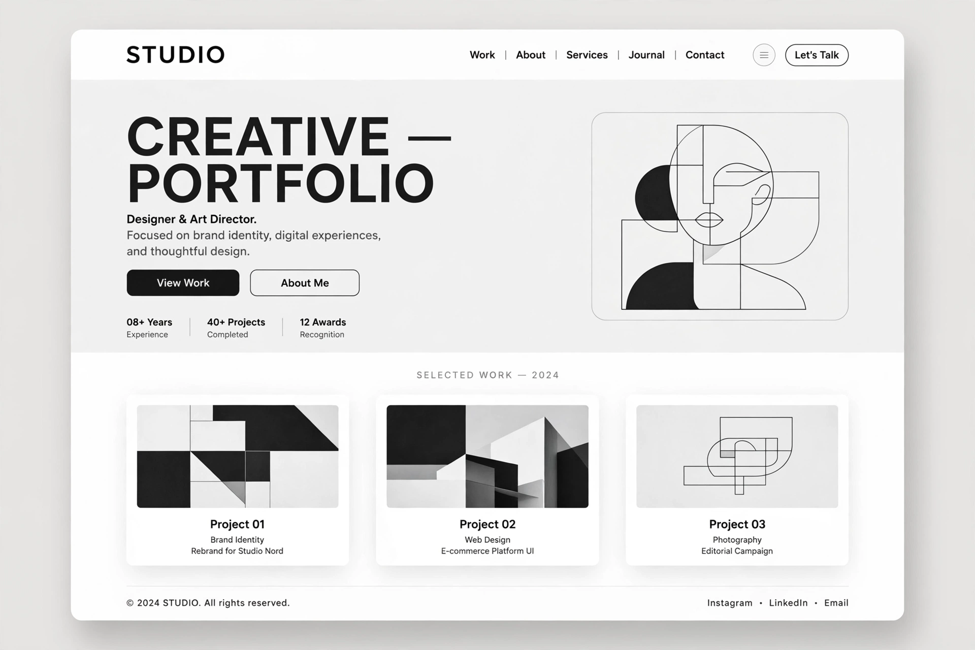
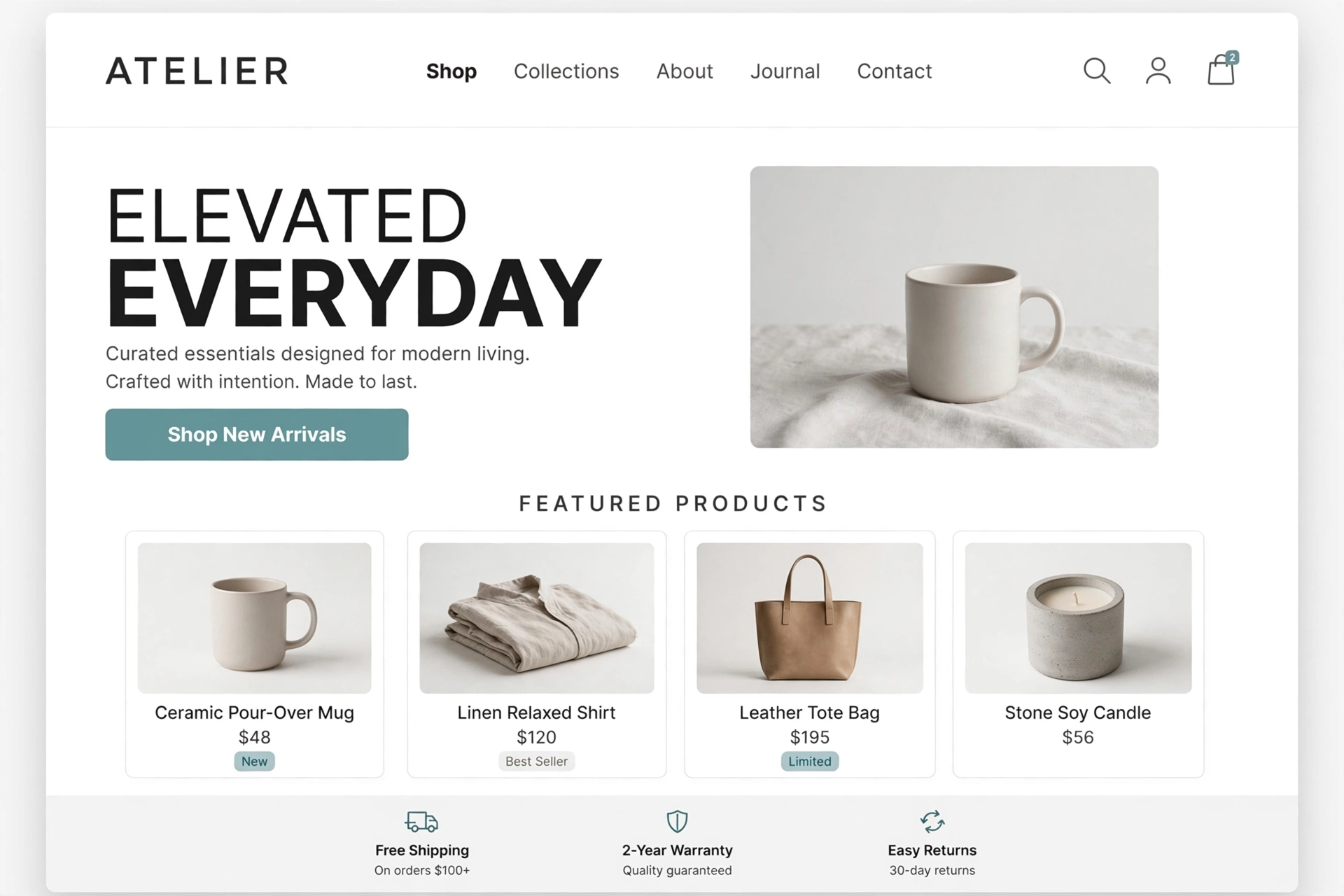
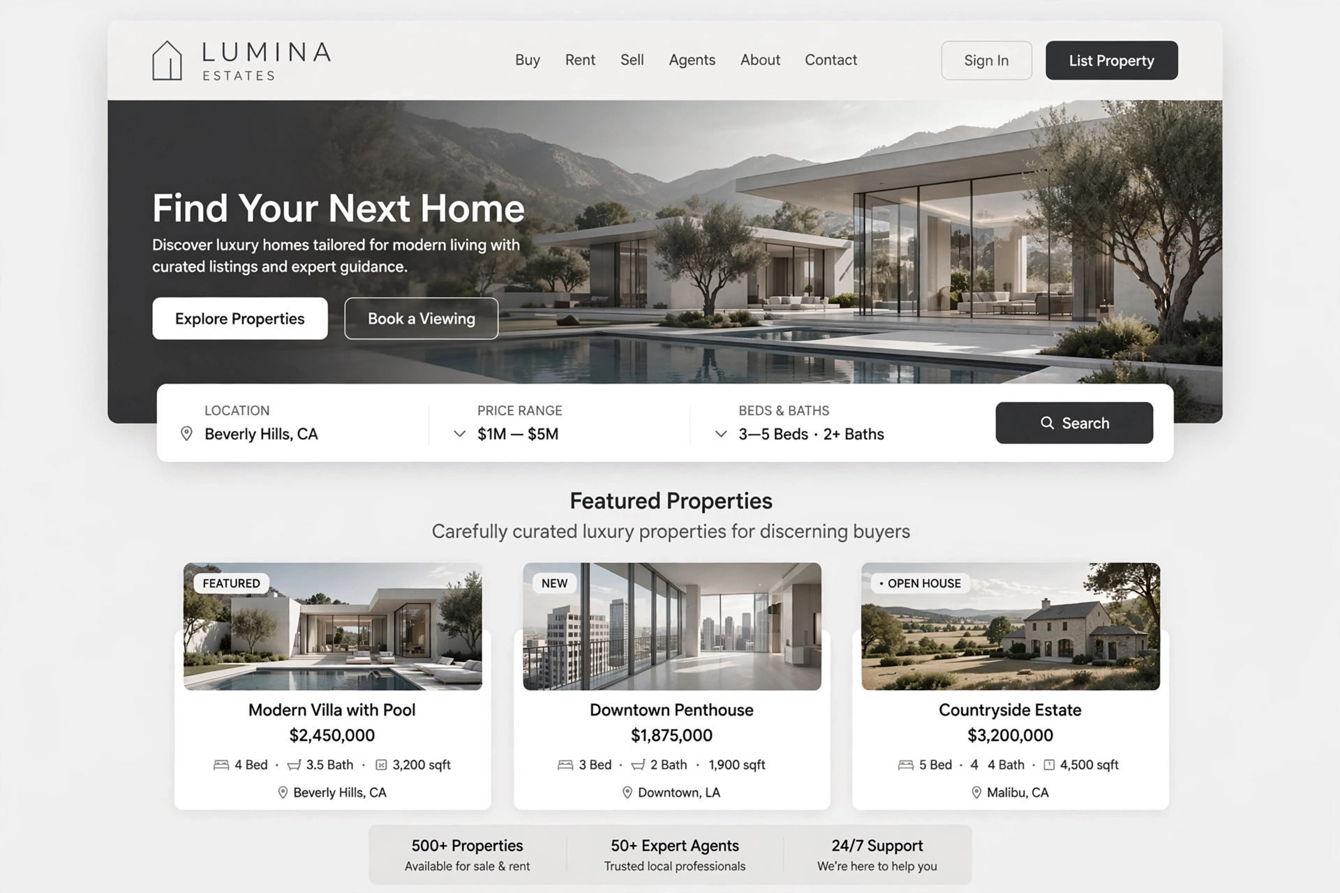
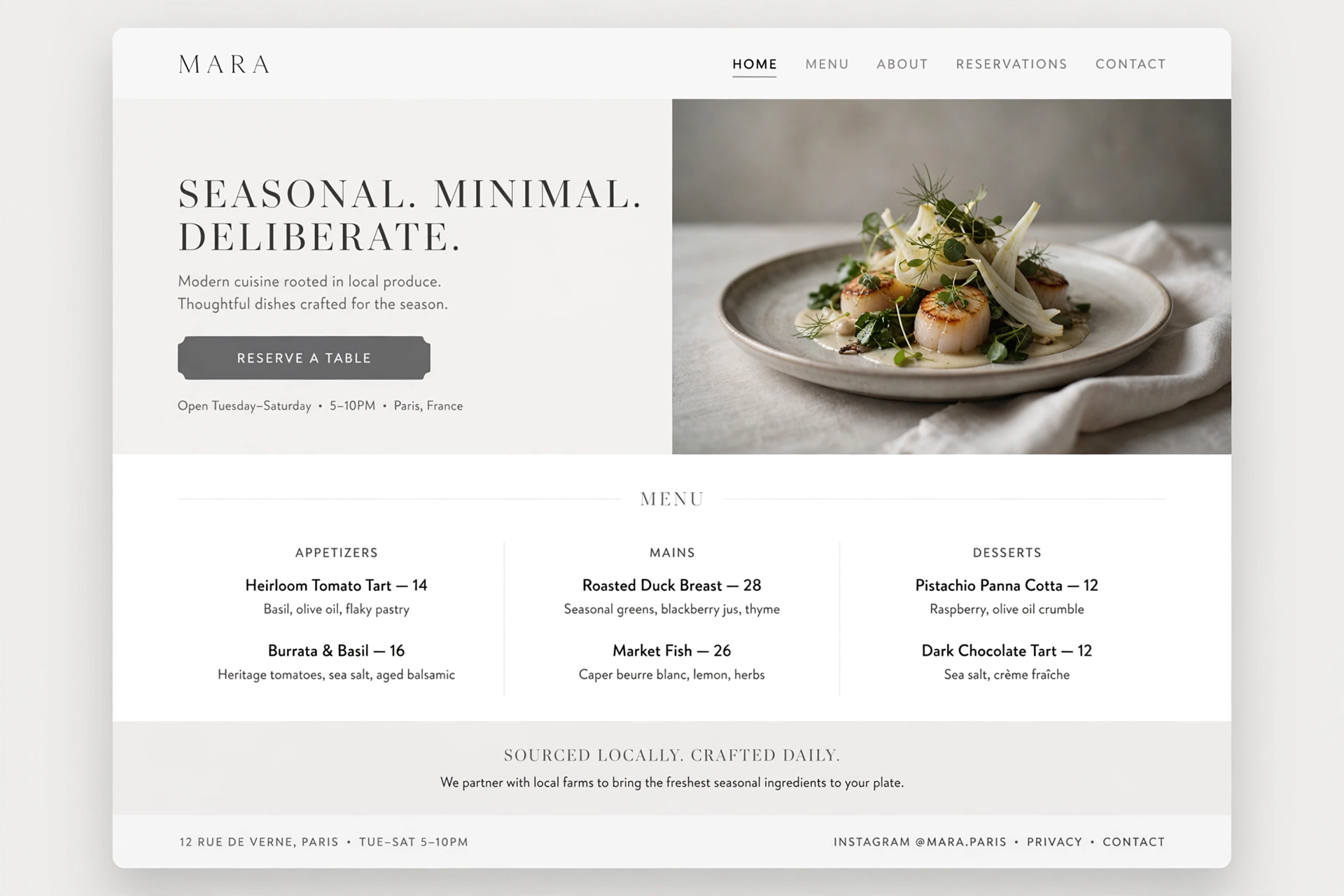

1. The Philosophy of Modern & Minimal Design
At its heart, modern minimal design is a philosophical stance that prioritizes essence over excess. It draws from the Bauhaus movement's "less is more" ethos and the Japanese concept of Ma — the deliberate use of empty space to create balance and harmony.
This philosophy extends beyond aesthetics into user experience. By removing visual clutter, we reduce cognitive load, allowing users to focus on what truly matters: content, functionality, and purpose. Every element in a minimal design must earn its place — if it doesn't serve a clear function, it doesn't belong.
For Everyone:
Think of minimal design like decluttering your home. You keep only what you love and what serves a purpose. The result is a calmer, more functional space where you can think clearly and act with intention.
2. Key Characteristics & Visual Language
Modern minimal design is defined by a distinct set of visual and structural characteristics that work together to create a cohesive, timeless aesthetic.
Let's explore each of these five core characteristics in detail — they form the visual vocabulary of modern minimal design.
3. The Power of Whitespace (Negative Space)
Ample whitespace — or negative space — is the cornerstone of minimal design. It refers to the deliberate empty areas around text, images, and other elements. Far from being "wasted" space, it serves a critical function: creating visual breathing room.
Whitespace draws the user's eye to primary content, improves readability, and reduces cognitive load. It also communicates elegance and sophistication — premium brands like Apple use whitespace as a key part of their visual identity.
/* A deliberate spacing system creates rhythm */
            :root {
            --space-xs: 0.25rem;
            --space-sm: 0.5rem;
            --space-md: 1rem;
            --space-lg: 2rem;
            --space-xl: 4rem;
            --space-2xl: 8rem;
            }

            /* Generous padding around content */
            .hero {
            padding: var(--space-2xl) var(--space-xl);
            margin-bottom: var(--space-xl);
            }

            /* Breathing room between paragraphs */
            p {
            margin-bottom: var(--space-lg);
            line-height: 1.8;
            }
For Everyone:
Whitespace is like the pauses between musical notes. Without pauses, music is just noise. Without whitespace, design is just visual clutter.
4. Restricted Color Palettes & Strategic Accents
Modern minimal design uses restricted color palettes — typically monochromatic or two-to-three color schemes. Neutral tones — whites, grays, blacks, and earth tones — form the foundation, creating a calm, sophisticated backdrop.
A single bold accent color is used strategically — primarily for Call-to-Action (CTA) buttons, links, and key interactive elements. This creates a clear visual hierarchy and guides the user's attention to the most important actions.
/* Neutral foundation with a single accent */
            :root {
            /* Neutrals */
            --color-bg: #f6f3ee;
            --color-text: #0e0d0b;
            --color-muted: #6b6557;
            --color-border: #d6cfc1;

            /* Single accent — used sparingly */
            --color-accent: #e8542c;
            --color-accent-hover: #c3431e;
            }

            /* Accent only on interactive elements */
            .btn-primary {
            background: var(--color-accent);
            color: #fff;
            }
            .btn-primary:hover {
            background: var(--color-accent-hover);
            }
For Everyone:
Think of color in minimal design like a black-tie wardrobe. The foundation is neutral and elegant, with a single bold accessory — a red tie or a statement necklace — that draws attention exactly where it should.
5. Bold Typography as Visual Foundation
Because minimal design uses fewer graphics, typography does the heavy lifting. Fonts are not just for reading — they are the primary visual element that establishes hierarchy, personality, and tone.
Modern minimal design favors high-contrast, clean sans-serif fonts like Inter, Helvetica, or SF Pro. These fonts are legible, neutral, and timeless. Variable fonts allow for a range of weights and styles in a single file, optimizing performance.
/* Typography — Clean, bold, and hierarchical */
            :root {
            --font-sans: 'Inter', -apple-system, BlinkMacSystemFont, sans-serif;
            --font-display: 'Cormorant Garamond', serif;

            /* Fluid type scale */
            --fs-xs: clamp(0.75rem, 0.8vw, 0.875rem);
            --fs-sm: clamp(0.875rem, 1vw, 1rem);
            --fs-base: clamp(1rem, 1.2vw, 1.25rem);
            --fs-lg: clamp(1.25rem, 1.8vw, 1.75rem);
            --fs-xl: clamp(2rem, 3vw, 3.5rem);
            --fs-2xl: clamp(3rem, 5vw, 6rem);
            }

            /* Bold headings establish hierarchy */
            h1 {
            font-family: var(--font-display);
            font-size: var(--fs-2xl);
            font-weight: 500;
            line-height: 1.05;
            letter-spacing: -0.02em;
            }
For Everyone:
Typography in minimal design is like the voice of a confident speaker. It's clear, deliberate, and commands attention without shouting. Every word is chosen with care.
6. Flat & Semi-Flat Design Aesthetics
Modern minimal design embraces flat or semi-flat aesthetics. This means abandoning complex 3D effects, heavy drop shadows, and excessive gradients in favor of a clean, two-dimensional look.
Semi-flat design adds subtle shadows and depth — just enough to indicate hierarchy and interactivity without sacrificing the clean aesthetic. This approach reduces visual noise, makes interfaces feel lighter, and improves perceived performance.
/* Flat design — clean, no unnecessary effects */
            .card {
            background: var(--color-bg);
            border: 1px solid var(--color-border);
            border-radius: 12px;
            padding: var(--space-lg);
            }

            /* Semi-flat — subtle depth for interactivity */
            .card:hover {
            box-shadow: 0 4px 12px rgba(0,0,0,0.06);
            transform: translateY(-2px);
            }

            /* No unnecessary gradients or heavy shadows */
            .btn {
            background: var(--color-text);
            color: var(--color-bg);
            border: 0;
            border-radius: 999px;
            padding: 12px 24px;
            }
For Everyone:
Flat design is like a well-designed poster — it relies on composition, color, and typography rather than visual gimmicks. It's honest, direct, and easy to understand.
8. User Experience & Usability Principles
Minimal design is user-centered by nature. By removing distractions, we create frictionless experiences where users can effortlessly find information or complete transactions.
Key UX principles in minimal design include: Hick's Law (fewer choices = faster decisions), Fitt's Law (important targets should be large and easy to reach), and Progressive Disclosure (show only what's needed, when it's needed).
For Everyone:
Good UX in minimal design is like a great hotel concierge — they anticipate your needs, provide clear direction, and make your stay effortless without being intrusive.
9. Performance & Mobile-First Responsiveness
One of the greatest advantages of minimal design is superior performance. Fewer graphics, smaller file sizes, and clean code result in blazing-fast load times — which is critical for both SEO rankings and user satisfaction.
Minimalist layouts are inherently responsive, adapting gracefully from desktop to tablet to smartphone. The mobile-first approach ensures that the core experience is perfect on the smallest screens, then progressively enhanced for larger ones.
<!-- Lazy loading for images — load only when visible -->
            <img
            src="hero.webp"
            loading="lazy"
            decoding="async"
            alt="Hero image"
            width="1200"
            height="630">

            <!-- Modern image formats — WebP/AVIF for smaller size -->
            <picture>
            <source srcset="hero.avif" type="image/avif">
            <source srcset="hero.webp" type="image/webp">
            <img src="hero.jpg" alt="Hero">
            </picture>

            <!-- Preconnect to critical origins -->
            <link rel="preconnect" href="https://images.unsplash.com" crossorigin>
For Everyone:
Performance in minimal design is like a luxury car's engine — you don't see it, but you feel it in every moment. Fast, responsive, and completely reliable.
10. Implementation Best Practices & Code
Implementing a modern minimal design requires discipline and intentionality. Here are the key best practices to follow:
/* Complete Minimal Design System */
            :root {
            /* 1. Colors — neutral with one accent */
            --bg: #faf8f4;
            --fg: #0e0d0b;
            --muted: #6b6557;
            --accent: #e8542c;
            --border: rgba(14, 13, 11, 0.1);

            /* 2. Typography — fluid & bold */
            --font: 'Inter', system-ui, sans-serif;
            --fs-base: clamp(1rem, 1.2vw, 1.25rem);

            /* 3. Spacing — generous & consistent */
            --space: clamp(1rem, 1.5vw, 2rem);
            --space-lg: clamp(2rem, 3vw, 4rem);

            /* 4. Borders — clean & subtle */
            --radius: 12px;
            }

            /* Apply the system */
            body {
            background: var(--bg);
            color: var(--fg);
            font-family: var(--font);
            font-size: var(--fs-base);
            line-height: 1.7;
            padding: var(--space-lg);
            }

            .container {
            max-width: 1152px;
            margin: 0 auto;
            padding: var(--space);
            }
For Everyone:
Implementing minimal design is like writing a haiku — every word must carry weight, every element must serve a purpose. It takes discipline, but the result is powerful and memorable.
11. Inspirations & Examples of Modern & Minimal Design
The best way to understand the power of modern and minimal design is to see it in action. Here are some real-world inspirations that embody the principles of clarity, whitespace, and intentional simplicity.
Apple — The Modern Minimal Standard
Apple's website is the gold standard of modern minimal design — generous whitespace, bold typography, cinematic imagery, and a focus on storytelling. Every element serves a purpose.
Visit AppleStripe — Clean & Functional
Stripe's website is a masterclass in functional minimalism — clean typography, restrained color palette, and an interface that makes complex technology feel simple and accessible.
Visit StripeDropbox — Minimal & Human
Dropbox's design system is minimal yet human — using clean layouts, playful illustrations, and generous spacing to make a technical product feel warm and approachable.
Visit DropboxFigma — Design Tool, Minimal Interface
Figma's website and product interface exemplify minimal design in practice — focusing on the user's work, with a clean UI that gets out of the way and lets creativity flow.
Visit FigmaLinear — Minimal & Meticulous
Linear's website and product are minimal design at its most meticulous — every pixel is considered, every interaction is smooth, and the visual language is consistently clean and elegant.
Visit LinearSiteInspire — Minimal Design Gallery
A curated gallery of the best minimal websites from around the world. Browse through hundreds of examples that showcase the power of simplicity, whitespace, and clean typography.
Visit SiteInspireFor Everyone:
Inspiration for minimal design is everywhere — from the clean interfaces of tech giants to the quiet elegance of Scandinavian interiors. The key is to observe how simplicity creates clarity and apply that to your own digital work.
12. Future Trends & Evolution of Modern & Minimal Design
As technology evolves and user expectations shift, modern minimal design is embracing new possibilities. Here are the key trends shaping the future of this timeless aesthetic.
AI‑Powered Minimalist Interfaces
Artificial intelligence is enabling hyper‑personalized minimal experiences — interfaces that adapt to individual user preferences, showing only what's relevant and hiding what's not. This is minimalism taken to its logical, adaptive extreme.
Kinetic & Responsive Typography
Typography in minimal design will become more dynamic and responsive — variable fonts that adjust weight and width based on screen size, user interaction, and even reading speed. Text becomes alive, yet still minimal.
Sustainability & "Digital Minimalism"
The minimalist philosophy is extending beyond aesthetics into digital sustainability — reducing page weight, optimizing images, and using clean code to minimize energy consumption. Minimal design is eco‑friendly design.
Dark Mode as a Default
Dark mode is becoming a standard expectation rather than a niche feature. Minimal design in dark mode offers a calm, immersive experience that reduces eye strain and feels elegant. The future will see seamless light/dark transitions as a core part of minimal systems.
Accessibility & Inclusive Minimalism
The future of minimal design is accessible by default — with proper contrast, scalable typography, and keyboard‑navigable interfaces. Minimal design is good for everyone, not just for those who can see clearly.
For Everyone:
Minimalism is not a trend — it's a philosophy. As the digital world becomes more complex, the brands that succeed will be those that cut through the noise with clarity, purpose, and simplicity.
Got questions?
Frequently Asked Questions
Everything you need to know about Modern & Minimal design — from core concepts to implementation.
Modern & Minimal web design is an approach centered around the philosophy that "less is more." It strips away superfluous elements, focusing purely on functionality, typography, ample whitespace, and user experience. It ensures blazing-fast load times and seamless navigation.
Every element in a minimal design must earn its place — if it doesn't serve a clear function, it doesn't belong. This philosophy extends beyond aesthetics into user experience, reducing cognitive load and allowing users to focus on what truly matters: content, functionality, and purpose.
The key characteristics include five core principles. Ample whitespace — deliberate empty areas that create visual breathing room and draw attention to primary content. Restricted color palettes — monochromatic or two-to-three color schemes with neutral tones and a single bold accent.
Bold typography — high-contrast, clean sans-serif fonts that establish visual hierarchy. Flat or semi-flat design — avoiding complex 3D effects in favor of clean two-dimensional aesthetics. And purposeful navigation — minimal menus and clear information architecture that guide users without clutter.
Whitespace — or negative space — is the cornerstone of minimal design. It creates visual breathing room, draws the user's eye to primary content, improves readability, and reduces cognitive load. Far from being "wasted" space, it serves a critical function in guiding attention.
Whitespace also communicates elegance and sophistication — premium brands like Apple use whitespace as a key part of their visual identity. Think of whitespace as the pauses between musical notes — without pauses, music is just noise. Without whitespace, design is just visual clutter.
Modern minimal design uses restricted color palettes — typically monochromatic or two-to-three color schemes. Neutral tones — whites, grays, blacks, and earth tones — form the foundation, creating a calm, sophisticated backdrop.
A single bold accent color is used strategically — primarily for call-to-action buttons, links, and key interactive elements. This creates a clear visual hierarchy and guides the user's attention to the most important actions. Think of it like a black-tie wardrobe — the foundation is neutral and elegant, with a single bold accessory that draws attention exactly where it should.
Modern & Minimal design is ideal for SaaS and tech products that value clarity and performance. Creative portfolios benefit from clean, focused presentation. Corporate websites communicate professionalism and trust. E-commerce platforms create premium shopping experiences. And brand landing pages make a strong first impression.
It works best when the brand values simplicity, clarity, and user-centered design. However, it may not be suitable for brands that want to express maximalism, playfulness, or experimental aesthetics. For those, styles like Creative & Bold or Brutalist & Industrial would be more appropriate.
One of the greatest advantages of minimal design is superior performance. Fewer graphics, smaller file sizes, and clean code result in blazing-fast load times — which is critical for both SEO rankings and user satisfaction. Studies show that 94% of first impressions are design-related, and minimal design creates a perception of professionalism and trust.
Minimalist layouts are inherently responsive, adapting gracefully from desktop to tablet to smartphone. The mobile-first approach ensures that the core experience is perfect on the smallest screens, then progressively enhanced for larger ones.
Best practices include embracing generous whitespace — use ample negative space for breathing room. Restrict your color palette — use neutral tones with a single bold accent. Use bold, clean typography — high-contrast sans-serif fonts establish hierarchy.
Adopt flat or semi-flat design — avoid heavy 3D effects and gradients. Simplify navigation — minimal menus and clear architecture. Optimize for performance — fewer graphics mean faster load times. And ensure accessibility — proper contrast, scalable typography, and keyboard-navigable interfaces. Minimalism should be good for everyone, not just for those who can see clearly.
Excellent sources of inspiration include Apple's website — the gold standard of modern minimal design with generous whitespace, bold typography, and cinematic imagery. Stripe's website is a masterclass in functional minimalism with clean typography and restrained color.
Dropbox's design system is minimal yet human with playful illustrations and generous spacing. Figma's website exemplifies minimal design in practice. Linear's website is minimal design at its most meticulous. And SiteInspire offers a curated gallery of the best minimal websites from around the world. Inspiration for minimal design is everywhere — from clean interfaces to the quiet elegance of Scandinavian interiors.
Still have questions? Let's talk
Ready to embrace Modern & Minimal?
Let's apply these principles to your next project and create a clean, timeless, and user-centered experience that stands out for all the right reasons.
Start your project