


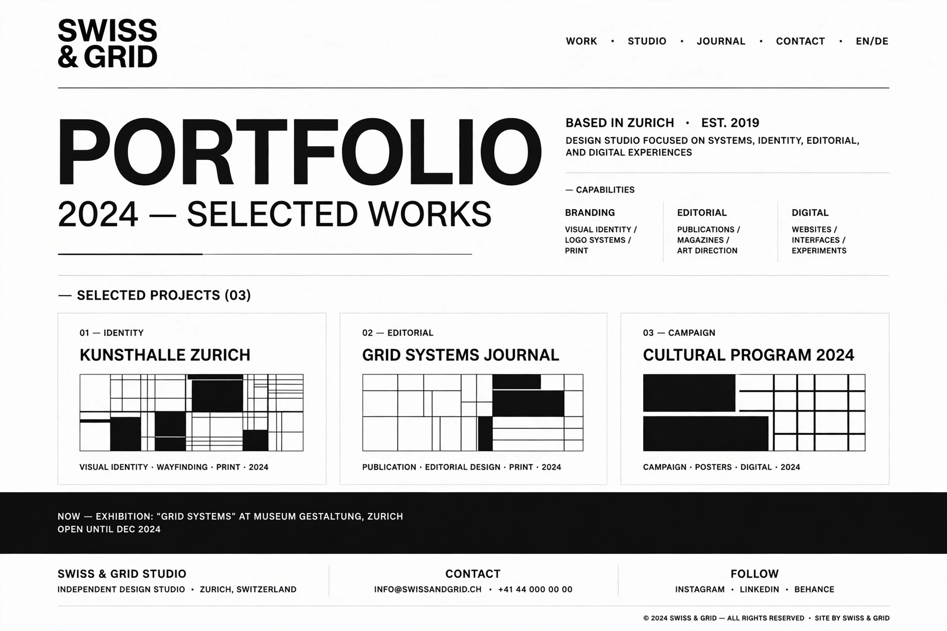
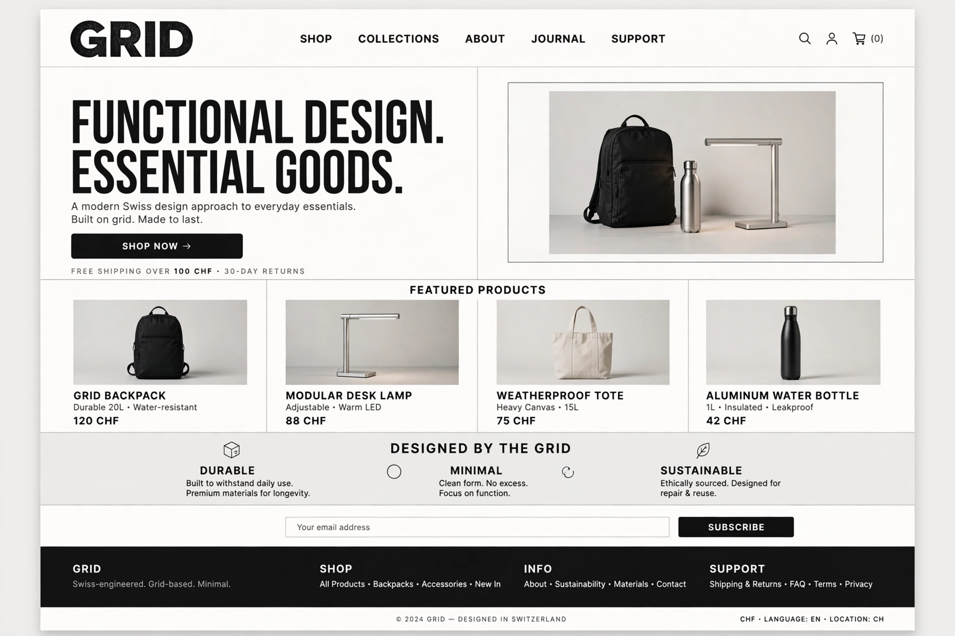
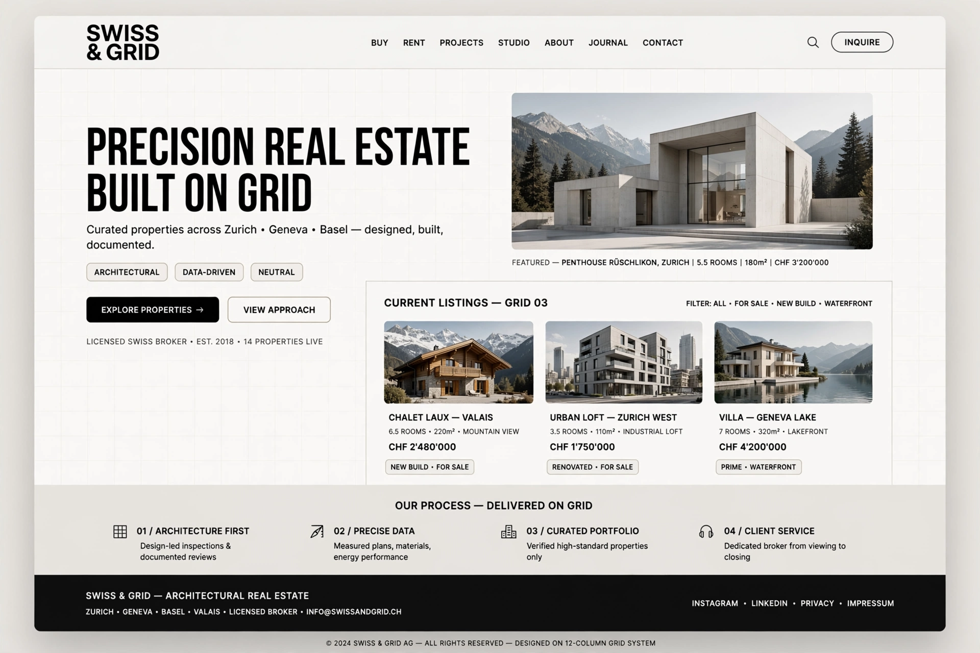
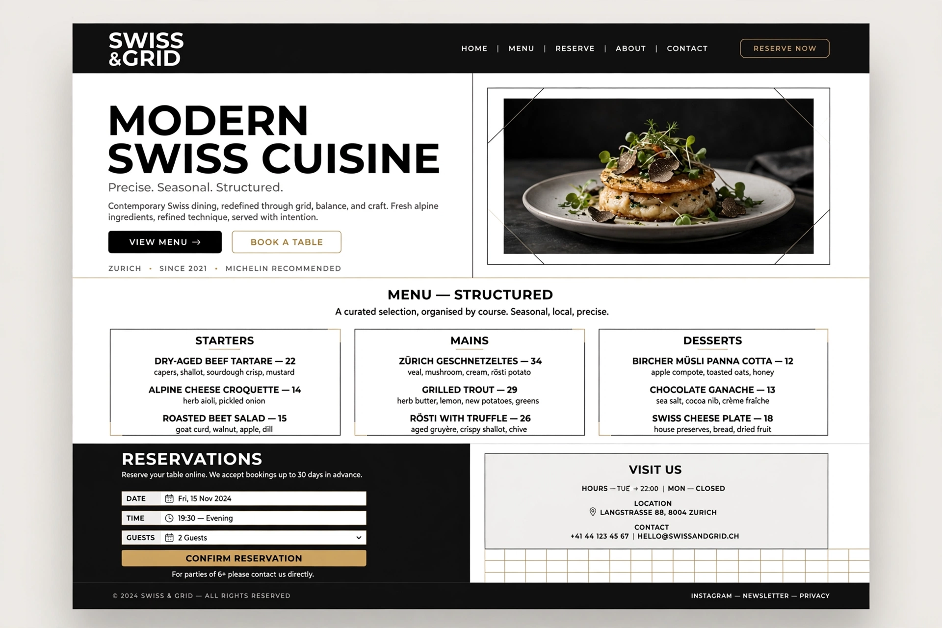
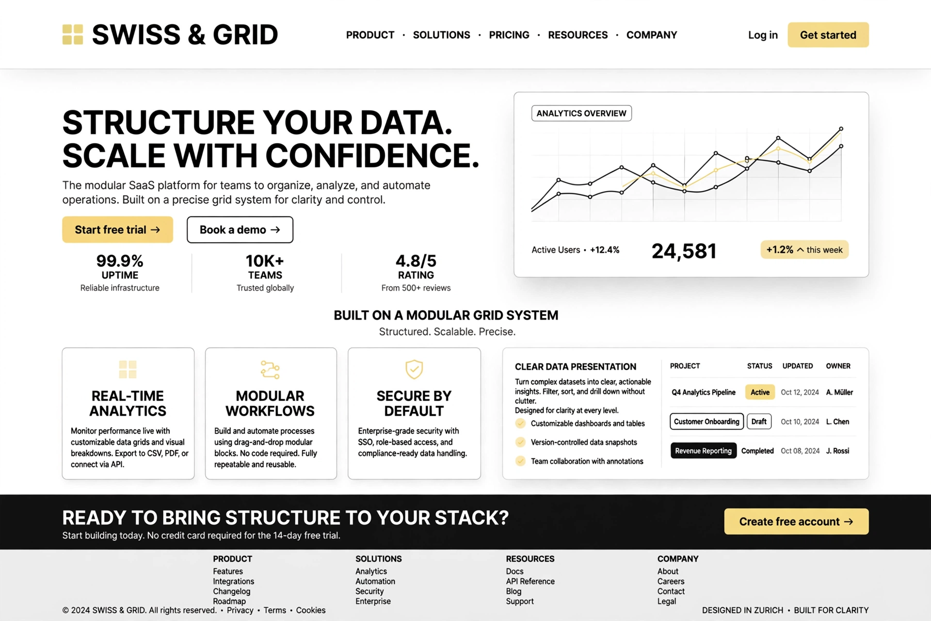
Swiss design and grid-based websites are digital extensions of the mid-20th century International Typographic Style. They prioritize readability, structural harmony, and mathematical precision. By using invisible, calculated modular grids, designers arrange text and imagery logically, stripping away decorative clutter for a clean, user-friendly experience.
Swiss & Grid in Action
1. The Core Foundations
Swiss design is built on three foundational pillars that work together to create exceptional visual clarity and structural harmony.
The core foundations include:
- ◆ Modular Grid Systems — A strict framework of intersecting horizontal and vertical lines.
- ◆ Emphasis on Typography — Highly legible, neutral sans-serif typefaces with careful hierarchy.
- ◆ Asymmetrical Balance — Off-center alignment that creates dynamic visual interest without compromising order.
For Everyone:
Swiss design is like a well-engineered building — every beam, column, and line serves a purpose, creating a structure that is both functional and beautiful.
2. Modular Grid Systems
Originating with design pioneers like Josef Müller-Brockmann, the grid is a strict framework of intersecting horizontal and vertical lines. In web design, this translates perfectly to CSS Grid and Flexbox, allowing content blocks, images, and menus to sit in mathematically precise locations.
/* Swiss Modular Grid System */
            .swiss-grid {
            display: grid;
            grid-template-columns: repeat(12, 1fr);
            gap: 1.5rem;
            max-width: 1440px;
            margin: 0 auto;
            padding: 2rem;
            }

            /* Content spans 8 columns, offset for asymmetry */
            .content-main {
            grid-column: 3 / 11;
            grid-row: span 2;
            }

            /* Sidebar — narrow, precise */
            .content-sidebar {
            grid-column: 11 / 13;
            padding: 1rem 0;
            }

            /* Feature block spans full width with inner grid */
            .feature-block {
            grid-column: 1 / 13;
            display: grid;
            grid-template-columns: subgrid;
            }
For Everyone:
A modular grid is like the blueprint of a building — it ensures structural integrity and harmony, allowing every element to find its rightful place.
3. Emphasis on Typography
Swiss design treats typography as the primary visual element. It relies strictly on highly legible, neutral sans-serif typefaces like Helvetica, Univers, and modern digital equivalents with carefully structured hierarchies — massive headlines paired with lighter body text.
/* Swiss Typography System */
            :root {
            --font-swiss: 'Helvetica Neue', 'Univers', -apple-system, sans-serif;
            --font-display: 'Helvetica Now', 'Helvetica', sans-serif;

            /* Hierarchical scale — large headlines, light body */
            --fs-hero: clamp(3.5rem, 7vw, 7rem);
            --fs-heading: clamp(2rem, 3vw, 3.5rem);
            --fs-body: clamp(1rem, 1.1vw, 1.125rem);
            --fs-small: 0.875rem;
            }

            .swiss-title {
            font-family: var(--font-display);
            font-size: var(--fs-hero);
            font-weight: 700;
            letter-spacing: -0.02em;
            line-height: 0.95;
            color: var(--fg);
            }

            .swiss-body {
            font-family: var(--font-swiss);
            font-size: var(--fs-body);
            font-weight: 400;
            line-height: 1.7;
            max-width: 70ch;
            }
For Everyone:
Typography in Swiss design is like the voice of a news anchor — it's clear, neutral, and authoritative, delivering information without distraction.
4. Asymmetrical Balance
While Swiss design is heavily structured, it embraces asymmetry. By aligning elements off-center, designers create dynamic visual interest without compromising order. This tension between structure and spontaneity is what makes Swiss design so compelling.
/* Asymmetrical Layout — Dynamic but Structured */
            .asym-grid {
            display: grid;
            grid-template-columns: 2fr 1.5fr 1fr;
            gap: 2rem;
            }

            /* Off-center hero — creates tension */
            .hero-asym {
            grid-column: 1 / 3;
            grid-row: 1 / 3;
            padding: 3rem 0;
            border-right: 2px solid var(--accent);
            }

            /* Supporting content — balanced on the right */
            .support-asym {
            grid-column: 3 / 4;
            padding: 2rem 0;
            font-size: var(--fs-small);
            color: var(--fg-mute);
            }

            /* Visual anchor — creates balance through contrast */
            .visual-anchor {
            grid-column: 2 / 4;
            grid-row: 3 / 4;
            background: var(--bg-sunk);
            padding: 2rem;
            border-radius: 0;
            }
For Everyone:
Asymmetrical balance is like a jazz composition — it's structured yet unexpected, creating a dynamic rhythm that keeps you engaged and interested.
5. How It Translates to Web Design
Swiss design principles are a natural fit for the web. The grid provides a solid foundation for responsive design, while the emphasis on typography ensures excellent readability across all devices.
For Everyone:
Swiss design on the web is like a well-organized library — you can find what you need quickly because everything has its place and the system is intuitive and predictable.
6. Minimalism and Negative Space
"Less is more" is a defining rule of Swiss design. Ample white space is used deliberately to balance the layout, separate content, and guide the user's eye exactly where it needs to go.
/* Deliberate Negative Space — Swiss Precision */
            .swiss-container {
            padding: 4rem 2rem;
            max-width: 1152px;
            margin: 0 auto;
            }

            /* Generous spacing between elements */
            .content-block {
            padding: 3rem;
            margin-bottom: 3rem;
            background: var(--bg-elev);
            border-left: 4px solid var(--accent);
            }

            /* Breathing room for readability */
            p {
            margin-bottom: 1.5rem;
            line-height: 1.8;
            max-width: 70ch;
            }

            /* Minimalist card — no decoration */
            .card-swiss {
            padding: 2rem;
            border: 1px solid var(--line);
            background: transparent;
            box-shadow: none;
            }
For Everyone:
Negative space in Swiss design is like the silence between words — it gives the content room to breathe and makes the message more powerful.
7. Flush Left, Ragged Right Text
You will often see typography left-aligned with a jagged right edge, rather than justified. This maintains a uniform letter and word spacing, which makes reading much easier and feels more natural and less rigid.
/* Flush Left, Ragged Right — Swiss Standard */
            .swiss-text {
            text-align: left;
            text-justify: none;
            hyphens: auto;
            word-spacing: normal;
            letter-spacing: 0.01em;
            }

            /* Clean, even spacing for headings */
            .swiss-heading {
            text-align: left;
            letter-spacing: -0.02em;
            margin-bottom: 0.5rem;
            }

            /* Body text with ideal line length */
            .swiss-body-text {
            text-align: left;
            max-width: 70ch;
            margin: 0 auto 1.5rem 0;
            font-size: var(--fs-body);
            line-height: 1.7;
            }
For Everyone:
Flush left text is like a clear, unhurried conversation — it flows naturally, with consistent pacing that makes it easy to follow and understand.
8. Neutrality and Clarity
The fundamental goal of Swiss design is to present information as objectively as possible. The interface shouldn't distract the user; it should guide them efficiently toward the content or action they are seeking.
/* Neutral, Objective Design */
            .swiss-neutral {
            background: var(--bg);
            color: var(--fg);
            font-family: var(--font-swiss);
            }

            /* No decorative elements — pure information */
            .info-block {
            border: 0;
            padding: 2rem 0;
            border-bottom: 1px solid var(--line);
            }

            /* Clear visual hierarchy without decoration */
            .info-block h2 {
            font-size: var(--fs-heading);
            font-weight: 700;
            margin-bottom: 0.5rem;
            }

            .info-block p {
            color: var(--fg-soft);
            max-width: 65ch;
            }
For Everyone:
Neutrality in Swiss design is like a transparent glass window — you see the view clearly without any distortion or distraction from the frame itself.
9. Functional Color Palettes
Colors are used deliberately to create structure, establish hierarchy, or draw attention to a single call-to-action, rather than to add frivolous decoration. Every color has a purpose.
/* Functional Color — Every Hue Has a Purpose */
            :root {
            /* Neutrals — for structure and readability */
            --color-bg: #ffffff;
            --color-text: #1a1a1a;
            --color-muted: #666666;
            --color-border: #e0e0e0;

            /* Accent — only for hierarchy and CTAs */
            --color-accent: #0055ff;
            --color-accent-hover: #0033cc;
            }

            /* Structure through color */
            .section-divider {
            background: var(--color-accent);
            height: 2px;
            width: 80px;
            margin: 1rem 0;
            }

            /* CTA — the only bold color element */
            .btn-primary {
            background: var(--color-accent);
            color: #fff;
            border: 0;
            padding: 0.8rem 2.5rem;
            font-weight: 600;
            border-radius: 0;
            letter-spacing: 0.05em;
            }
For Everyone:
Functional color is like a highlighter on a page — you only use it to emphasize what matters most, not to decorate the entire page.
10. Why It's Still Relevant
Swiss design principles form the backbone of many modern UI/UX frameworks. Because the underlying grid is mathematically sound, it scales beautifully across various screen sizes, ensuring a seamless, responsive experience. Websites built using these principles load faster, feature lower cognitive load, and have highly intuitive navigation.
/* Swiss-Inspired Responsive Framework */
            .grid-system {
            display: grid;
            grid-template-columns: repeat(12, 1fr);
            gap: 1.5rem;
            padding: 2rem;
            max-width: 1440px;
            margin: 0 auto;
            }

            /* Responsive breakpoints — maintain the grid */
            @media (max-width: 1024px) {
            .grid-system {
            grid-template-columns: repeat(8, 1fr);
            gap: 1rem;
            }
            }

            @media (max-width: 600px) {
            .grid-system {
            grid-template-columns: 1fr;
            gap: 1rem;
            padding: 1rem;
            }
            }

            /* Consistent typography across breakpoints */
            .swiss-headline {
            font-size: clamp(2rem, 4vw, 4.5rem);
            font-weight: 700;
            line-height: 1.05;
            letter-spacing: -0.02em;
            }
For Everyone:
Swiss design endures because it's built on fundamental truths about human perception — order, clarity, and simplicity will never go out of style.
11. Inspirations & Examples of Swiss & Grid Design
The best way to understand the power of Swiss and grid design is to see it in action. Here are some real-world inspirations that embody the principles of typographic excellence, structural clarity, and functional minimalism.
CSS Grid — The Modern Swiss Grid
CSS Grid is the digital implementation of Swiss grid principles — allowing designers to create precise, modular layouts with mathematical precision. The spec itself is inspired by the International Typographic Style.
Learn CSS GridJosef Müller-Brockmann — Grid Master
The godfather of Swiss design. His work — including posters, books, and the seminal "Grid Systems" — laid the foundation for modern typographic design. A must-study for any grid enthusiast.
Explore Müller-BrockmannAwwwards — Swiss Design Collection
A curated collection of award-winning Swiss-inspired websites — showcasing how modern designers are applying grid systems, typographic hierarchy, and functional minimalism to digital projects.
Visit AwwwardsGrid Systems — The Ultimate Reference
Josef Müller-Brockmann's "Grid Systems in Graphic Design" is the definitive text on modular grids. Still essential reading for designers 50+ years after its publication.
See the BookSiteInspire — Grid-Based Websites
SiteInspire curates the best grid-based websites from around the world — a constant source of inspiration for typographic layout, modular systems, and clean Swiss-inspired design.
Visit SiteInspireHelvetica — The Swiss Typeface
Helvetica is the quintessential Swiss typeface — designed in 1957 by Max Miedinger, it embodies the principles of neutrality, clarity, and functional beauty. Still the most widely used sans-serif in design.
Learn About HelveticaFor Everyone:
Swiss and grid design is the foundation of modern digital design. From CSS Grid to the typography of your favourite website, the principles of the International Typographic Style are everywhere — once you see them, you can't unsee them.
12. Future Trends & Evolution of Swiss & Grid Design
As technology evolves and digital design grows more complex, Swiss and grid design is adapting to new challenges and opportunities. Here are the key trends shaping the future of this foundational design approach.
AI‑Powered Grid Generation
AI tools are beginning to automate grid generation — suggesting optimal column structures, gutter sizes, and breakpoints based on content analysis. This will make Swiss design principles more accessible to a wider range of designers.
Responsive & Adaptive Grids
Future grid systems will be more intelligent and adaptive — automatically reflowing content based on device, context, and even user behaviour. The grid will become dynamic rather than static.
Variable & Kinetic Typography
Swiss typography is evolving with variable fonts — typefaces that can smoothly adjust weight, width, and optical size. This brings a new dimension to typographic hierarchy while maintaining the clarity and neutrality of the Swiss tradition.
Design Systems & Component-Based Grids
Swiss grid principles are being codified into design systems — with reusable grid components, consistent spacing tokens, and typographic scales. This ensures grid-based harmony at scale across complex products.
Accessibility & Inclusive Typography
The future of Swiss design is accessible to everyone — with proper contrast ratios, scalable type, and inclusive design principles. Swiss clarity is good for all users, not just those who can see well.
For Everyone:
The future of Swiss design is about clarity in complexity. As digital experiences grow more sophisticated, the principles of the grid and typographic clarity will become even more essential — helping users navigate an increasingly complex digital world.
Got questions?
Frequently Asked Questions
Everything you need to know about Swiss & Grid design — from core concepts to implementation.
Swiss & Grid web design is a typography-driven approach rooted in the mid-20th century International Typographic Style. It prioritises readability, structural harmony, and mathematical precision through modular grid systems, clean sans-serif typefaces, asymmetrical balance, and functional minimalism.
The goal is to present information as objectively and clearly as possible, guiding users efficiently toward content or actions. It's the foundation of modern digital design — built on a framework of order and clarity.
The key elements include modular grid systems — strict frameworks of intersecting horizontal and vertical lines that provide structural harmony. Emphasis on typography — highly legible, neutral sans-serif typefaces like Helvetica, Univers, or Inter with careful hierarchy ranging from massive headlines to light body text.
Asymmetrical balance — off-center alignment that creates dynamic visual interest without compromising order. Minimalism and negative space — ample white space that balances the layout and guides the eye. Flush left, ragged right text — natural reading flow. And functional color palettes — colors used deliberately to create structure and hierarchy, never for decoration alone.
Unlike Modern & Minimal which focuses on overall simplicity, Swiss & Grid design specifically emphasises typographic excellence and structural precision through grids. Unlike Creative & Bold which prioritises visual impact and experimentation, Swiss design is restrained, neutral, and functional.
Unlike Scandinavian & Organic which uses soft, natural elements, Swiss design is rigorous, mathematical, and typography-driven. It's the most structured and precise of all design styles — built on a foundation of order and clarity. It's like the difference between a well-engineered building and a natural landscape.
Swiss & Grid design is ideal for editorial and publishing platforms where typographic excellence is paramount. Corporate and professional websites benefit from the structured, trustworthy aesthetic that communicates precision and reliability.
Data-heavy dashboards and analytics tools use grids to present complex information clearly. Portfolio and gallery sites showcase work with precision and order. And SaaS products that prioritise clarity and usability over flashy visuals. It's perfect for any project where information needs to be presented with exceptional clarity and precision.
Swiss & Grid design uses highly legible, neutral sans-serif typefaces. Helvetica is the quintessential Swiss typeface — designed in 1957 by Max Miedinger, it embodies the principles of neutrality, clarity, and functional beauty. It's still the most widely used sans-serif in design.
Univers is another classic Swiss typeface with a comprehensive weight system that provides exceptional flexibility. Modern alternatives include Inter, SF Pro, and Helvetica Now. The key is to use a single, well-crafted typeface with a clear hierarchy — massive headlines paired with lighter body text — and avoid decorative or expressive fonts that compromise legibility.
Implement a modular grid system using CSS Grid or Flexbox. A 12-column grid is the most flexible and widely used — it can be divided into 1, 2, 3, 4, 6, or 12 equal parts. Define consistent gap sizes (1rem to 1.5rem) and use span classes for different content widths.
Ensure the grid is responsive by using relative units and media queries to adjust column counts — 12 columns on desktop, 8 on tablet, and 1 on mobile. Use subgrids for nested layouts to maintain alignment. The key is mathematical precision — every element should align to the grid, creating visual harmony and order across the entire layout.
Best practices include using modular grid systems — implement CSS Grid or Flexbox with a strict framework of intersecting lines. Emphasize typography — use highly legible, neutral sans-serif fonts with careful hierarchy. Embrace asymmetrical balance — align elements off-center for dynamic interest.
Use minimalism and negative space — ample white space guides the user's eye and creates balance. Apply functional color palettes — every color should have a purpose, never use color for decoration alone. Use flush left, ragged right text for natural reading flow. And optimize for performance — Swiss design should be lightweight and fast, with clean code and optimized assets.
Excellent sources of inspiration include CSS Grid documentation — the digital implementation of Swiss grid principles that shows how grids work in modern web design. Josef Müller-Brockmann's archive — the godfather of Swiss design whose work laid the foundation for modern typographic design and grid systems.
Awwwards has a curated collection of award-winning Swiss-inspired websites that showcase how modern designers apply these principles. The book 'Grid Systems in Graphic Design' by Müller-Brockmann is the definitive text on modular grids. SiteInspire curates the best grid-based websites from around the world. And Helvetica — the quintessential Swiss typeface — is a source of inspiration in itself. Once you start looking, you'll see Swiss design everywhere.
Still have questions? Let's talk
Ready to build with precision?
Let's apply these Swiss and grid design principles to your next project and create a structured, typography-driven digital experience that delivers exceptional clarity.
Start your project