


Scandinavian and Organic web designs prioritize simplicity, functionality, and a deep connection to nature. Rooted in Nordic minimalism, they feature bright, neutral color palettes, ample whitespace, and natural textures. These designs create a calming, user-friendly digital environment perfect for lifestyle, wellness, and eco-friendly brands.
Scandinavian & Organic in Action
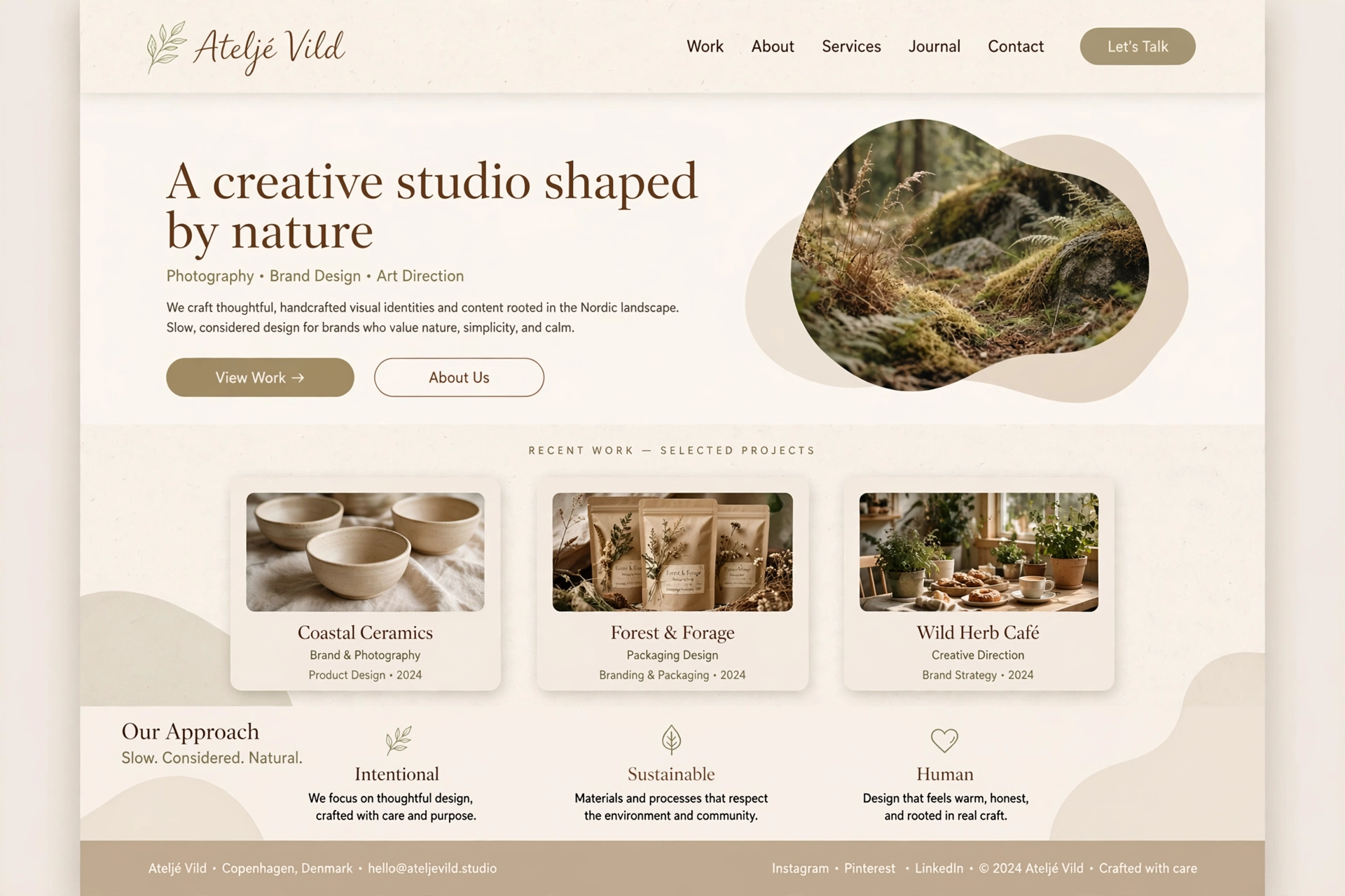
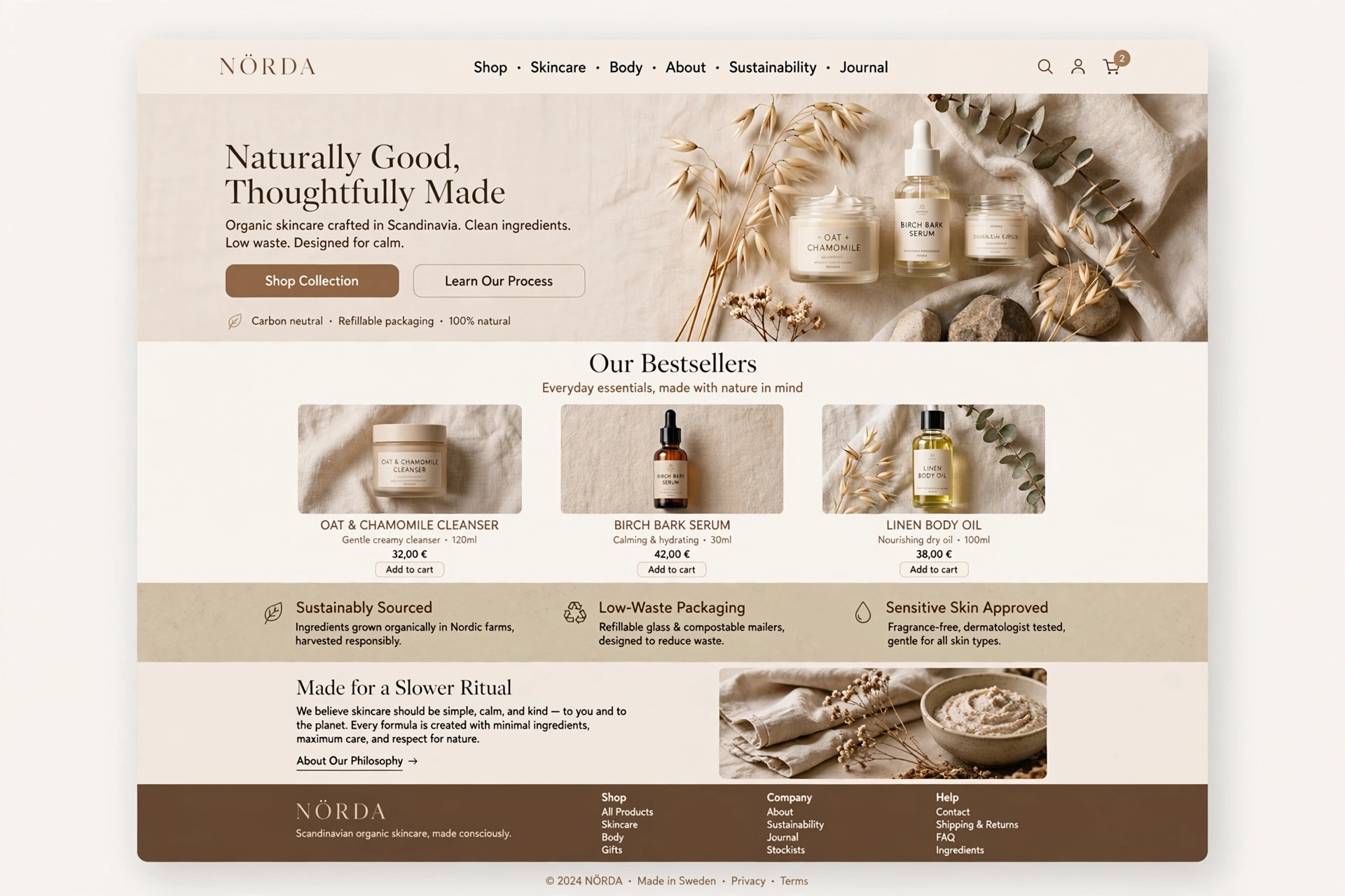
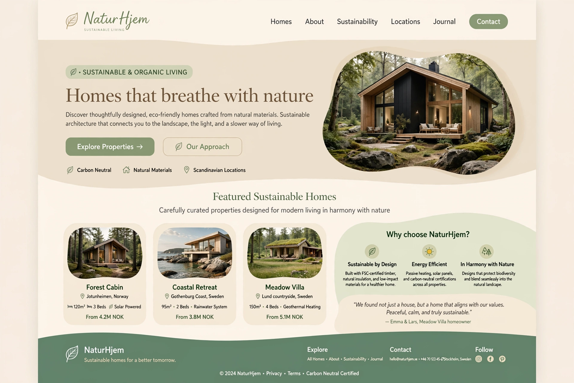
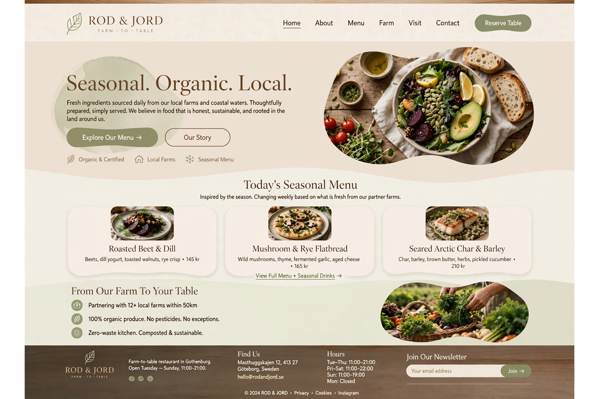
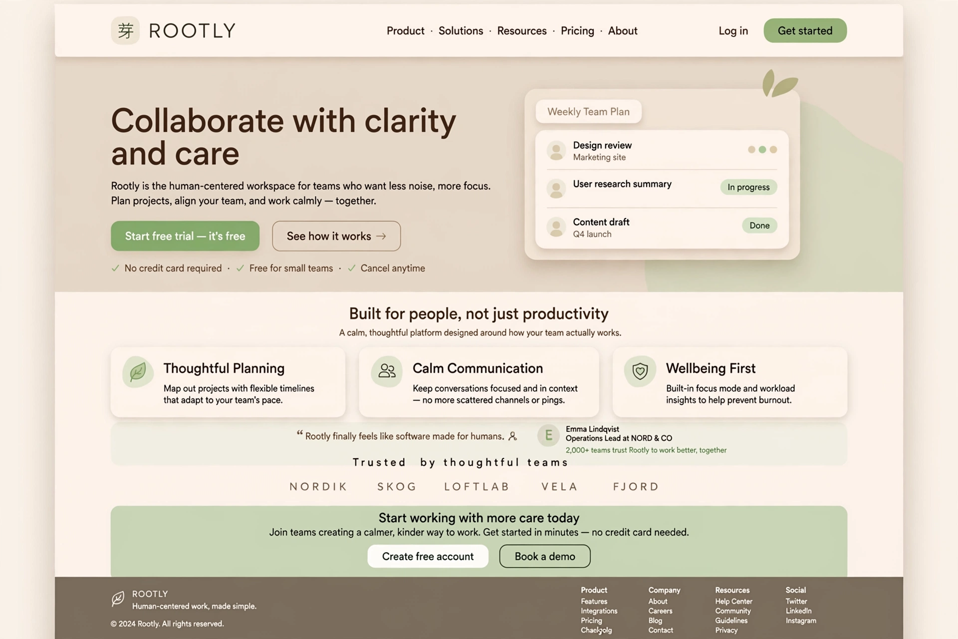
1. Key Principles of Scandinavian Web Design
Scandinavian design originated in the Nordic countries as a philosophy of making functional, beautiful objects accessible. When translated to UI/UX design, it features a distinct set of principles that prioritize simplicity, functionality, and human-centered design.
The core principles include:
- ◆ Minimalism and Whitespace — Stripping away clutter for an airy, spacious feel.
- ◆ Light & Neutral Color Palettes — Warm whites, soft beiges, and light grays.
- ◆ Typography-Driven — Clean, modern sans-serif fonts with high readability.
- ◆ Functionality First — Intuitive navigation that feels practical and comfortable.
For Everyone:
Scandinavian design is like a cozy Nordic cabin — it's warm, inviting, and every element serves a purpose. It feels like coming home.
2. Minimalism & Whitespace
Clutter is stripped away. Designs feature generous padding, clean lines, and an "airy" feel that gives content room to breathe. Whitespace is not empty — it's a deliberate design element that creates balance and focus.
/* Scandinavian Whitespace System */
            :root {
            /* Generous spacing — airy and calm */
            --space-xs: 0.5rem;
            --space-sm: 1rem;
            --space-md: 2rem;
            --space-lg: 4rem;
            --space-xl: 6rem;
            --space-2xl: 10rem;
            }

            /* Clean, uncluttered layout */
            .scandi-container {
            padding: var(--space-lg) var(--space-md);
            max-width: 1152px;
            margin: 0 auto;
            background: #faf8f4;
            }

            /* Generous padding around content */
            .content-block {
            padding: var(--space-lg);
            margin-bottom: var(--space-xl);
            background: var(--bg-elev);
            border-radius: 1rem;
            box-shadow: 0 2px 8px rgba(0,0,0,0.02);
            }

            /* Breathing room for text */
            p {
            line-height: 1.8;
            max-width: 70ch;
            margin-bottom: var(--space-md);
            }
For Everyone:
Whitespace in Scandinavian design is like snow on a winter landscape — it creates tranquility and clarity, allowing the important elements to stand out.
3. Light & Neutral Color Palettes
Backgrounds are typically warm whites, soft beiges, or light grays. Contrast is introduced through dark typography or deep, earthy tones rather than loud, flashy colors.
/* Scandinavian Color System — Light & Neutral */
            :root {
            /* Warm neutrals */
            --scandi-white: #faf8f4;
            --scandi-beige: #f0ebe3;
            --scandi-gray: #e8e4dd;
            --scandi-stone: #d6cfc1;

            /* Contrast — dark but warm */
            --scandi-charcoal: #2a2722;
            --scandi-brown: #5c4e3d;

            /* Accent — subtle and earthy */
            --scandi-accent: #8b7a6b;
            --scandi-wood: #b8956a;
            }

            /* Apply to body */
            body {
            background: var(--scandi-white);
            color: var(--scandi-charcoal);
            font-family: 'Inter', system-ui, sans-serif;
            }

            /* Subtle accent for CTAs */
            .btn-accent {
            background: var(--scandi-wood);
            color: var(--scandi-white);
            border: 0;
            padding: 0.8rem 2rem;
            border-radius: 999px;
            transition: background 300ms;
            }
            .btn-accent:hover {
            background: var(--scandi-charcoal);
            }
For Everyone:
Scandinavian color palettes are like a winter sunrise — soft, warm, and peaceful. They create a sense of calm and clarity without ever shouting for attention.
4. Typography-Driven Design
Clean, modern sans-serif fonts are standard in Scandinavian design. High readability and logical hierarchy are the focal points, avoiding over-the-top decorative text.
/* Clean, readable typography */
            :root {
            --font-scandi: 'Inter', -apple-system, BlinkMacSystemFont, sans-serif;
            --font-heading: 'Cormorant Garamond', serif;

            /* Fluid type scale — calm and readable */
            --fs-base: clamp(1rem, 1.1vw, 1.125rem);
            --fs-heading: clamp(2rem, 3vw, 3.5rem);
            --fs-display: clamp(2.5rem, 4.5vw, 5rem);
            }

            body {
            font-family: var(--font-scandi);
            font-size: var(--fs-base);
            line-height: 1.7;
            letter-spacing: 0.01em;
            }

            h1, h2, h3 {
            font-family: var(--font-heading);
            font-weight: 500;
            line-height: 1.15;
            color: var(--scandi-charcoal);
            }

            h1 {
            font-size: var(--fs-display);
            letter-spacing: -0.02em;
            }

            /* Gentle contrast between headings and body */
            h2 {
            font-size: var(--fs-heading);
            margin-bottom: 0.5rem;
            }
For Everyone:
Typography in Scandinavian design is like a clear, calm voice — it speaks with clarity and confidence, without needing to raise its volume to be heard.
5. Functionality First & Intuitive Navigation
Navigation is intuitive, simple, and stripped of unnecessary bells and whistles. The interface should feel as practical and comfortable as a well-designed Nordic home.
<!-- Clean, intuitive Nordic navigation -->
            <nav class="nav-scandi" aria-label="Primary">
            <ul class="nav-list">
            <li><a href="#home" class="is-active">Home</a></li>
            <li><a href="#about">About</a></li>
            <li><a href="#work">Work</a></li>
            <li><a href="#contact">Contact</a></li>
            </ul>
            </nav>

            <!-- Subtle mobile toggle -->
            <button class="menu-toggle"
            aria-label="Toggle menu"
            aria-expanded="false">
            <span></span>
            <span></span>
            <span></span>
            </button>

            <!-- Clear, readable content -->
            <main class="content">
            <h1>Welcome to a simpler way</h1>
            <p>Every element here serves a purpose. Nothing more, nothing less.</p>
            </main>
For Everyone:
Functional design is like a well-organized kitchen — everything is in its place, intuitive to use, and makes daily life easier without unnecessary complexity.
6. Characteristics of Organic Web Design
Organic web design expands on minimalism by introducing elements that mimic the natural world. It is heavily utilized by organic skincare, wellness, and sustainable food companies.
Key organic characteristics include:
- ◆ Earthy Color Palettes — Sage green, terracotta, sand, and warm wood browns.
- ◆ Soft, Curving Shapes — Irregular, undulating, and organic geometric forms.
- ◆ Natural Textures — Subtle tactile backgrounds like linen, paper, or stone.
For Everyone:
Organic design is like a walk in the forest — it feels grounded, natural, and restorative, connecting you to something authentic and timeless.
7. Earthy Color Palettes & Natural Tones
Instead of purely monochromatic schemes, organic designs incorporate muted tones inspired by nature, such as sage green, terracotta, sand, and warm wood browns.
/* Earthy, Organic Color Palette */
            :root {
            /* Earth tones */
            --organic-clay: #c4a88a;
            --organic-sage: #8a9a8a;
            --organic-terracotta: #c87a5a;
            --organic-sand: #e8dccc;
            --organic-forest: #4a5a4a;
            --organic-stone: #b8b0a8;
            --organic-ochre: #c4a050;
            }

            /* Background — warm and natural */
            .organic-bg {
            background: var(--organic-sand);
            color: var(--organic-forest);
            }

            /* Accent elements with earthy tones */
            .accent-clay {
            background: var(--organic-clay);
            color: #fff;
            }

            .accent-sage {
            background: var(--organic-sage);
            color: #fff;
            }

            .accent-terracotta {
            background: var(--organic-terracotta);
            color: #fff;
            }
For Everyone:
Earthy colors are like a walk through a sun-drenched forest — they feel grounded, calming, and authentic, connecting us to the natural world.
8. Soft, Curving Shapes & Organic Geometry
Hard grids and rigid lines are replaced with irregular, undulating, and organic geometric shapes. This introduces a fluid, flowing feel to the web layout.
/* Soft, organic shapes */
            .organic-shape {
            border-radius: 50% 50% 40% 60% / 60% 40% 60% 40%;
            background: var(--organic-sage);
            opacity: 0.08;
            position: absolute;
            width: 300px;
            height: 300px;
            pointer-events: none;
            }

            /* Wavy divider between sections */
            .wave-divider {
            height: 80px;
            background:
            url("data:image/svg+xml,%3Csvg xmlns='http://www.w3.org/2000/svg' viewBox='0 0 1440 80'%3E%3Cpath d='M0 40 C360 80, 720 0, 1080 40 L1440 20 L1440 80 L0 80 Z' fill='%23e8dccc' /%3E%3C/svg%3E");
            background-size: cover;
            background-position: center;
            }

            /* Irregular grid — breaking the pattern */
            .organic-grid {
            display: grid;
            grid-template-columns: 1fr 0.6fr 1.4fr;
            gap: 2rem;
            }

            .organic-grid-item {
            border-radius: 30% 70% 60% 40% / 40% 50% 50% 60%;
            padding: 2rem;
            background: var(--bg-elev);
            }
For Everyone:
Organic shapes are like pebbles smoothed by a river — they have no sharp edges and feel natural, gentle, and harmonious to the eye.
9. Natural Textures & Tactile Imagery
Backgrounds often feature subtle, tactile textures like linen, recycled paper, or raw stone, adding depth to the visual experience. These textures make the digital feel physical and warm.
/* Natural textures — linen, paper, stone */
            .texture-linen {
            background-color: #f5f0e8;
            background-image:
            repeating-linear-gradient(
            0deg,
            transparent,
            transparent 2px,
            rgba(0,0,0,0.02) 2px,
            rgba(0,0,0,0.02) 4px
            ),
            repeating-linear-gradient(
            90deg,
            transparent,
            transparent 2px,
            rgba(0,0,0,0.02) 2px,
            rgba(0,0,0,0.02) 4px
            );
            }

            .texture-paper {
            background-color: #faf8f4;
            background-image:
            url("data:image/svg+xml,%3Csvg xmlns='http://www.w3.org/2000/svg' width='100' height='100'%3E%3Cfilter id='n'%3E%3CfeTurbulence type='fractalNoise' baseFrequency='0.8' numOctaves='4' stitchTiles='stitch'/%3E%3C/filter%3E%3Crect width='100' height='100' filter='url(%23n)' opacity='0.05'/%3E%3C/svg%3E");
            }

            /* Tactile element — warm wood grain */
            .texture-wood {
            background:
            linear-gradient(90deg, #d4b896 0%, #c4a88a 20%, #d4b896 40%, #c4a88a 60%, #d4b896 80%, #c4a88a 100%);
            background-size: 200% 100%;
            animation: woodGrain 8s ease-in-out infinite;
            }

            @keyframes woodGrain {
            0% { background-position: 0% 0%; }
            50% { background-position: 100% 0%; }
            100% { background-position: 0% 0%; }
            }
For Everyone:
Natural textures are like the feel of a handcrafted object — they add warmth and humanity to the digital world, making it feel more real and inviting.
10. Combining Scandinavian & Organic (Hygge & Cozy Minimalism)
When these two styles merge, they form a highly sought-after aesthetic characterized by cozy minimalism. This combination is often described by the Danish word "Hygge" — a feeling of cozy contentment and well-being.
/* Hygge — Cozy Scandinavian + Organic */
            .hygge-container {
            background: #faf8f4;
            color: #2a2722;
            font-family: 'Inter', system-ui, sans-serif;
            max-width: 1152px;
            margin: 0 auto;
            padding: 2rem;
            border-radius: 2rem;
            box-shadow: 0 4px 24px rgba(0,0,0,0.02);
            }

            /* Cozy, welcoming imagery */
            .hygge-image {
            border-radius: 30% 70% 40% 60% / 50% 40% 60% 50%;
            overflow: hidden;
            filter: sepia(0.1) brightness(1.02);
            transition: filter 600ms;
            }

            .hygge-image:hover {
            filter: sepia(0) brightness(1);
            }

            /* Warm, inviting typography */
            .hygge-heading {
            font-family: 'Cormorant Garamond', serif;
            font-weight: 500;
            color: #3a322a;
            letter-spacing: -0.02em;
            }

            /* Soft, diffused lighting effect */
            .soft-glow {
            box-shadow:
            0 0 40px rgba(200, 180, 160, 0.15),
            0 0 80px rgba(200, 180, 160, 0.05);
            }
For Everyone:
Hygge is like a warm cup of tea on a rainy day — it's a feeling of comfort, contentment, and well-being that makes you want to stay a little longer.
Who Should Use This Design Style?
Because this design style conveys trust, calm, and sustainability, it is ideal for:
- ◆ Interior Design & Furniture Brands — Brands like Toteme use this aesthetic to mirror their physical products.
- ◆ Wellness & Skincare — Health, supplement, and cosmetics brands use organic shapes and earthy palettes to highlight natural ingredients.
- ◆ Eco-Friendly & Sustainable Startups — The minimalist approach perfectly aligns with a "less is more" environmental philosophy.
For Everyone:
Scandinavian and Organic design is for brands that want to communicate authenticity, warmth, and sustainability — it's the visual language of trust and well-being.
11. Inspirations & Examples of Scandinavian & Organic Design
The best way to understand the power of Scandinavian and organic design is to see it in action. Here are some real-world inspirations that embody the principles of cozy minimalism, natural aesthetics, and functional simplicity.
Toteme — Scandinavian Minimalism
Toteme's website is a masterclass in Nordic minimalism — generous whitespace, muted color palettes, and a focus on clean typography. The design mirrors the brand's commitment to simplicity and craftsmanship.
Visit Toteme&Tradition — Nordic Furniture
&Tradition's website showcases organic shapes and natural materials — soft curves, warm wood tones, and a layout that feels as comfortable as the furniture they sell.
Visit &TraditionKinfolk — Organic Lifestyle
Kinfolk's digital presence is a celebration of slow living and organic aesthetics — earthy tones, soft textures, and a layout that feels unhurried and intentional. The epitome of hygge.
Visit KinfolkGANNI — Scandinavian with a Twist
GANNI's website combines Scandinavian simplicity with playful touches — vibrant imagery, bold typography, and a layout that feels both premium and approachable.
Visit GANNILush — Natural & Organic
Lush's website is a prime example of organic design — earthy color palettes, hand-drawn illustrations, and a tactile, natural feel that perfectly aligns with their ethical, handmade products.
Visit LushSiteInspire — Scandinavian & Organic
SiteInspire curates the best Scandinavian and organic websites from around the world — a constant source of fresh ideas for minimal, nature-inspired design.
Visit SiteInspireFor Everyone:
Inspiration for Scandinavian and organic design is everywhere — from the pages of a design magazine to the warmth of a Nordic cabin. The key is to observe how nature and simplicity come together and apply that harmony to your digital work.
12. Future Trends & Evolution of Scandinavian & Organic Design
As technology evolves and consumer values shift, Scandinavian and organic design is embracing new possibilities. Here are the key trends shaping the future of this calm, nature-inspired aesthetic.
Sustainable & Eco-Conscious Design
As environmental awareness grows, Scandinavian and organic design will increasingly prioritize digital sustainability — lightweight websites, optimized images, and ethical hosting. The aesthetic of "less is more" will become a commitment to the planet.
Biophilic Design & Nature-Inspired Interfaces
Biophilic design — bringing nature into the digital space — will become more sophisticated. Expect to see dynamic natural elements like flowing water, swaying grass, and changing light that respond to user interaction.
Warm Technology & Human-Centred AI
Scandinavian design principles are being applied to AI interfaces — creating chatbots and AI tools that feel warm, helpful, and human rather than cold and mechanical. The future of tech is cozy and approachable.
Mental Health & Digital Well-Being
As digital fatigue grows, Scandinavian and organic design will be at the forefront of mental health-conscious design — interfaces that are calm, unhurried, and designed to reduce stress rather than increase it.
Accessibility & Inclusive Minimalism
The future of Scandinavian and organic design is accessible to everyone — with proper contrast, scalable typography, and inclusive design principles. Simplicity should be universal, not exclusive.
For Everyone:
The future of design is calm, human, and connected to nature. As our digital lives become more complex, the brands that succeed will be those that offer peace, simplicity, and authenticity — the hallmarks of Scandinavian and organic design.
Got questions?
Frequently Asked Questions
Everything you need to know about Scandinavian & Organic design — from core concepts to implementation.
Scandinavian & Organic web design is a calming, nature-inspired approach that combines Nordic minimalism with organic aesthetics. It features bright, neutral color palettes, ample whitespace, natural textures, and functional, human-centered design.
Rooted in the concept of "Hygge" — a feeling of cozy contentment — these designs create a stress-free, welcoming digital environment perfect for lifestyle, wellness, and eco-friendly brands. It's about bringing the warmth and simplicity of Nordic living to the digital world.
The key elements include minimalism and whitespace — generous padding and clean lines for an airy, spacious feel. Light and neutral color palettes — warm whites, soft beiges, and light grays that feel calm and inviting.
Typography-driven design — clean, modern sans-serif fonts with high readability and logical hierarchy. Functionality first — intuitive navigation that feels practical and comfortable. And organic characteristics — earthy colors, soft curving shapes, and natural textures like linen, paper, or stone that bring the natural world into the digital space.
Hygge is a Danish word that describes a feeling of cozy contentment and well-being — like a warm cup of tea on a rainy day. In design, Hygge translates to creating warm, inviting, and stress-free digital experiences that make users feel comfortable and at ease.
It means designing for human comfort and connection, not just functionality. Scandinavian and Organic design embodies Hygge through soft colors, natural textures, generous whitespace, and an overall sense of calm and authenticity. It's about making people feel good when they interact with your digital product.
Scandinavian & Organic design is ideal for interior design and furniture brands where the aesthetic mirrors their physical products. Wellness and skincare brands use it to highlight natural ingredients and convey authenticity and trust.
Eco-friendly and sustainable startups align with the "less is more" environmental philosophy. Lifestyle and mindfulness brands use it to create calm, trustworthy digital spaces. It's perfect for any brand that wants to communicate warmth, authenticity, and a deep connection to nature.
Scandinavian design uses warm whites, soft beiges, and light grays as the foundation — creating a calm, sophisticated backdrop that feels airy and inviting. Contrast is introduced through dark typography or deep, earthy tones like charcoal and warm browns.
Organic design expands this palette with earthy colors like sage green, terracotta, sand, and warm wood browns. The overall palette feels like a winter sunrise — soft, warm, peaceful, and never harsh. It's a palette that soothes rather than stimulates.
Incorporate organic elements by using earthy color palettes — sage green, terracotta, sand, and warm wood browns that feel grounded and natural. Add soft, curving shapes — irregular, undulating forms that feel fluid and organic rather than rigid and mechanical.
Use natural textures — subtle tactile backgrounds like linen, paper, or stone that make the digital feel physical and warm. Consider biophilic elements — imagery of nature, plants, and natural materials. And use organic typography — fonts with a human, handcrafted feel. The goal is to mimic the natural world and create a sense of calm and authenticity.
Best practices include embracing minimalism and whitespace — strip away clutter and use generous padding for an airy feel. Use light and neutral color palettes — warm whites, soft beiges, and light grays. Prioritize typography-driven design — clean, modern sans-serif fonts with high readability.
Incorporate organic elements — earthy colors, soft curving shapes, and natural textures. Create a human-centric experience — focus on 'Hygge' and design for well-being. And optimize for performance — Scandinavian design should be lightweight and fast. The key is to create a sense of calm, authenticity, and connection to nature.
Excellent sources of inspiration include Toteme — a masterclass in Nordic minimalism with generous whitespace and muted palettes. &Tradition showcases organic shapes and natural materials in furniture design. Kinfolk's digital presence is a celebration of slow living and organic aesthetics.
GANNI combines Scandinavian simplicity with playful touches. Lush is a prime example of organic design with earthy palettes and hand-drawn illustrations. And SiteInspire curates the best Scandinavian and organic websites from around the world — a constant source of fresh ideas. Inspiration is everywhere — from the pages of a design magazine to the warmth of a Nordic cabin.
Still have questions? Let's talk
Ready to embrace cozy minimalism?
Let's apply these Scandinavian and organic design principles to your next project and create a calming, authentic digital experience that connects with your audience.
Start your project