


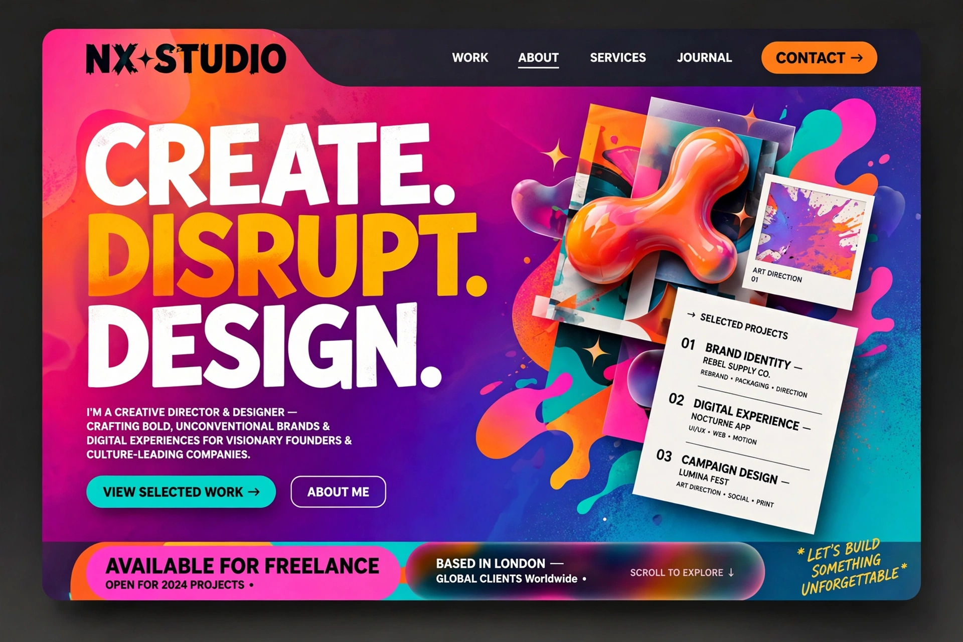
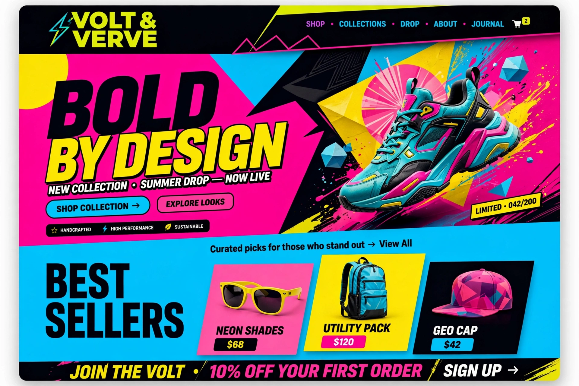
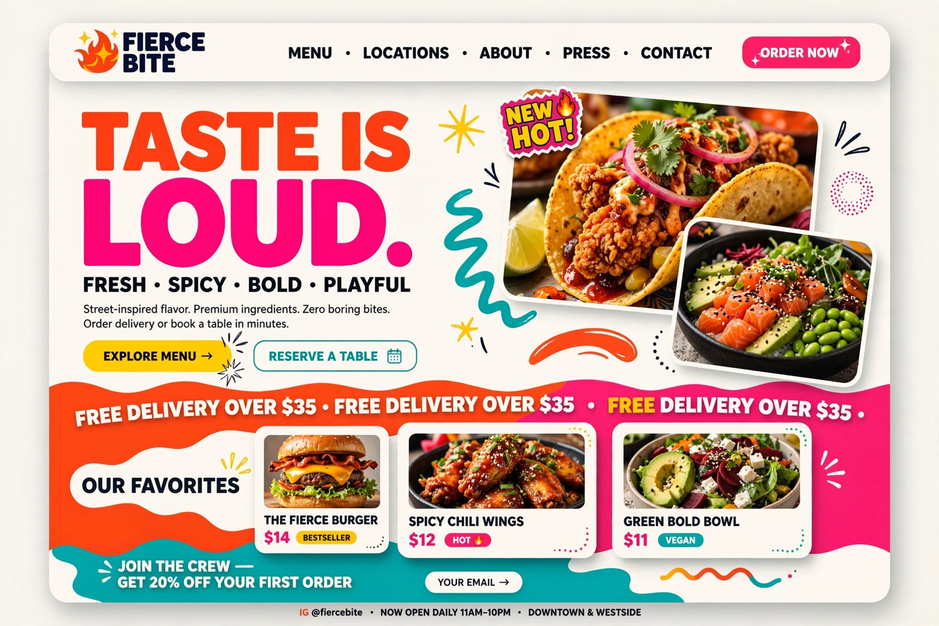
Creative and bold web design breaks traditional rules to create striking, memorable digital experiences. It utilizes high-contrast colors, oversized typography, asymmetrical layouts, and custom motion graphics to grab user attention. Rather than prioritizing standard, invisible navigation, these designs intentionally make the interface an engaging part of the brand storytelling.
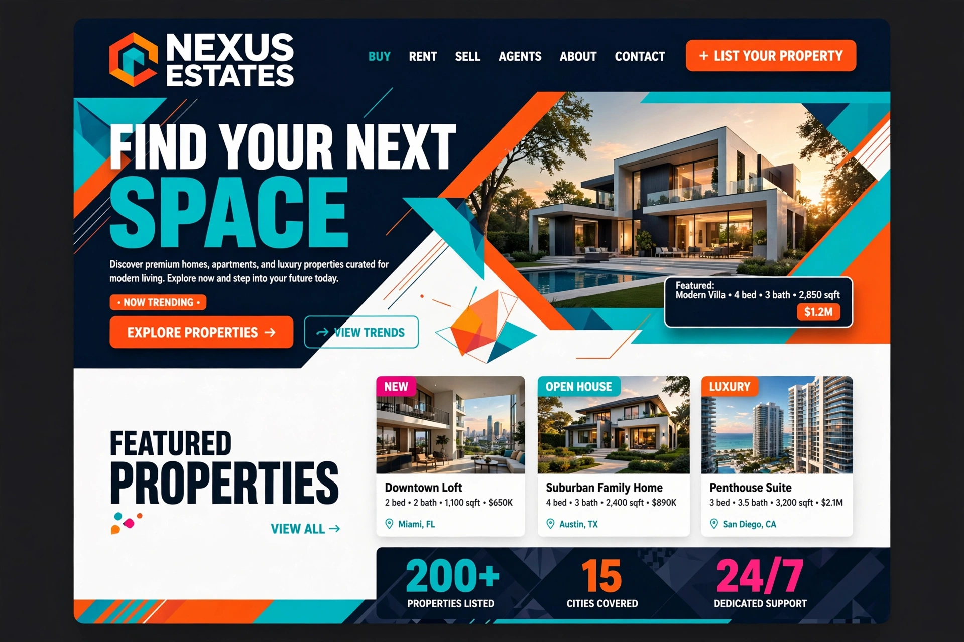
Creative & Bold in Action
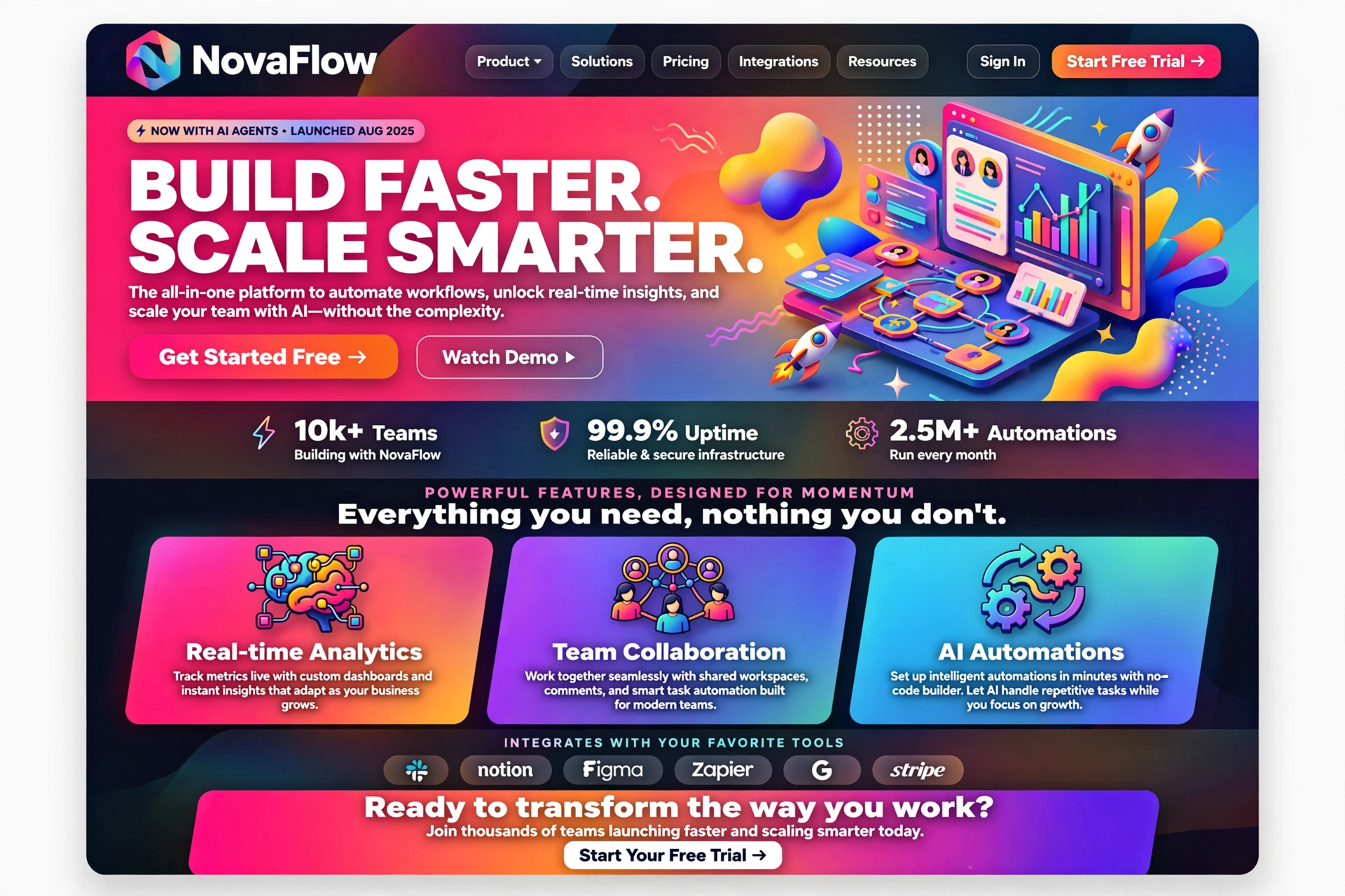
1. Core Pillars of Creative & Bold Design
Creative and bold design is built on four foundational pillars that work together to create striking, memorable digital experiences.
Each of these pillars will be explored in detail in the following sections:
- ◆ Oversized Typography — Bold, custom fonts that establish immediate visual hierarchy.
- ◆ Vibrant and Clashing Colors — High-impact palettes that evoke strong emotions.
- ◆ Asymmetrical & Grid-Breaking Layouts — Unconventional compositions that challenge expectations.
- ◆ Advanced Motion & Micro-Interactions — Dynamic, responsive animations that engage users.
For Everyone:
Creative and bold design is like a piece of modern art — it challenges expectations, evokes emotion, and leaves a lasting impression that a conventional design simply cannot.
2. Oversized Typography
Instead of relying solely on imagery, creative and bold sites use massive, custom fonts to establish a strong, immediate visual hierarchy. Typography becomes the hero element.
/* Oversized, expressive typography */
            :root {
            --font-display: 'Cormorant Garamond', serif;
            --fs-giant: clamp(4rem, 10vw, 10rem);
            --fs-huge: clamp(3rem, 6vw, 6rem);
            }

            .hero-title {
            font-family: var(--font-display);
            font-size: var(--fs-giant);
            font-weight: 700;
            line-height: 0.9;
            letter-spacing: -0.04em;
            text-transform: uppercase;
            background: linear-gradient(135deg, #ff3366, #ff6b3d);
            -webkit-background-clip: text;
            -webkit-text-fill-color: transparent;
            }

            /* Typography that breaks out of containers */
            .full-bleed {
            margin-left: -20vw;
            margin-right: -20vw;
            padding: 2rem 0;
            text-align: center;
            }
For Everyone:
Oversized typography is like a bold headline on a magazine cover — it demands attention, conveys confidence, and sets the tone for everything that follows.
3. Vibrant and Clashing Colors
Embracing bold palettes — such as neons, color-blocking, or unexpected contrast (like deep black against electric pink) — evokes strong emotional responses and helps brands stand out in crowded markets.
/* Bold, vibrant color system */
            :root {
            --neon-pink: #ff2d55;
            --electric-blue: #00d4ff;
            --deep-black: #0a0a0a;
            --vivid-orange: #ff6b3d;
            --lime-green: #7fff00;
            }

            /* Color-blocking with high contrast */
            .color-block {
            background: var(--deep-black);
            color: var(--neon-pink);
            padding: 4rem 2rem;
            margin: 1rem 0;
            border-left: 8px solid var(--electric-blue);
            }

            /* Clashing colors for maximum impact */
            .clash {
            background: linear-gradient(135deg, var(--neon-pink), var(--lime-green));
            color: var(--deep-black);
            padding: 2rem;
            font-weight: 900;
            text-transform: uppercase;
            }
For Everyone:
Bold colors are like a statement jacket — they announce your presence with confidence and make you unforgettable in a sea of neutrals.
4. Asymmetrical & Grid-Breaking Layouts
Ditching standard symmetrical templates in favor of overlapping elements, "Bento box" tile arrangements, or off-center compositions. These layouts create visual tension and dynamism.
/* Asymmetrical, grid-breaking layout */
            .asym-grid {
            display: grid;
            grid-template-columns: 2fr 1.5fr 1fr;
            gap: 1.5rem;
            max-width: 1440px;
            margin: 0 auto;
            }

            /* Overlapping elements — breaking the grid */
            .overlap {
            grid-column: 1 / 3;
            grid-row: 1 / 3;
            z-index: 2;
            transform: translateX(-10%) rotate(-2deg);
            }

            /* Bento-inspired tile layout */
            .bento-tile {
            background: var(--bg-elev);
            border-radius: 1.5rem;
            padding: 2rem;
            border: 1px solid var(--line);
            transition: transform 400ms var(--ease-out);
            }

            .bento-tile:hover {
            transform: scale(1.03) rotate(1deg);
            }
For Everyone:
Asymmetrical layouts are like a modern sculpture — they challenge traditional harmony and create dynamic tension that keeps the viewer engaged and exploring.
5. Advanced Motion & Micro-Interactions
Incorporating fluid scrolling, 3D elements, and hover effects that react dynamically as the user interacts with the page. Motion in bold design is expressive and intentional.
/* Expressive, dynamic motion */
            .float {
            animation: float 6s ease-in-out infinite;
            }

            @keyframes float {
            0%, 100% { transform: translateY(0px) rotate(-2deg); }
            50% { transform: translateY(-20px) rotate(2deg); }
            }

            /* Scroll-triggered reveal with personality */
            .reveal-bounce {
            opacity: 0;
            transform: scale(0.8) rotate(-5deg);
            transition:
            opacity 0.8s cubic-bezier(0.34, 1.56, 0.64, 1),
            transform 0.8s cubic-bezier(0.34, 1.56, 0.64, 1);
            }

            .reveal-bounce.is-visible {
            opacity: 1;
            transform: scale(1) rotate(0deg);
            }

            /* 3D tilt on hover */
            .card-3d {
            transition: transform 600ms var(--ease-out);
            transform-style: preserve-3d;
            }
            .card-3d:hover {
            transform: perspective(800px) rotateX(6deg) rotateY(-8deg);
            }
For Everyone:
Motion in creative design is like dance — every movement is expressive and deliberate, adding energy and meaning to the overall performance.
6. Where to Find Inspiration
To see cutting-edge examples of creative and bold design, explore platforms that curate experimental and award-winning work.
For Everyone:
Finding inspiration is like visiting an art gallery — you don't copy what you see, but you absorb the energy and ideas to fuel your own creative vision.
7. Implementation Approach
When implementing a creative and bold design, consider these key factors to ensure your project is successful.
Define Your Intent
Ask yourself: What reaction do you want to create? Bold design is about evoking emotion — whether that's excitement, curiosity, or a sense of daring.
Balance with Usability
While breaking rules, never break fundamental usability. Users should still be able to navigate, read, and take action — just in a more engaging way.
Test Extensively
Bold design choices — especially motion and color — must be tested across devices and browsers to ensure they work as intended. Performance should never be sacrificed for visual impact.
For Everyone:
Implementation is like building a stage for a performance — the design is the set, the content is the script, and the user is the audience you want to captivate.
8. Experimental vs. Artistic vs. Corporate
Creative and bold design exists on a spectrum. Understanding where your brand sits helps guide decisions.
Experimental
Pushes boundaries to the extreme. Often uses unconventional navigation, abstract visuals, and highly custom interactions. Best for design studios, art portfolios, and experimental brands.
Artistic
Balances creativity with structure. Uses bold visual elements but maintains clear usability. Ideal for creative agencies, fashion brands, and editorial platforms.
Bold yet Corporate
Applies creative principles within a professional framework. Uses bold colors, dynamic typography, and modern layouts while maintaining trust and credibility. Suitable for tech companies, startups, and modern enterprises.
For Everyone:
Choosing the right level of boldness is like choosing the volume of music — it should be loud enough to be heard, but not so loud that it overwhelms the message.
9. Framework & Platform Selection
The technology stack you choose can significantly impact the execution of creative and bold designs.
- ◆ React / Next.js — Excellent for dynamic, interactive experiences with complex motion and state management.
- ◆ Webflow — Great for designers who want to implement bold layouts without deep coding, offering robust animation controls.
- ◆ Three.js / WebGL — Essential for 3D elements and immersive, interactive experiences.
- ◆ GSAP / Framer Motion — Industry-leading animation libraries for creating smooth, complex motion sequences.
- ◆ WordPress with custom themes — Flexible for content-driven creative sites with custom styling and animation plugins.
For Everyone:
Choosing the right platform is like choosing the right brush for a painting — the tool must match the vision and technique to bring the creative idea to life.
10. Best Practices for Bold Design
To ensure your creative and bold design is effective, follow these best practices:
- ◆ Start with a strong concept: Bold design without purpose is just noise. Every bold choice should serve the brand's story.
- ◆ Maintain readability: Even with oversized typography and clashing colors, ensure text is legible and content is scannable.
- ◆ Optimize performance: Bold designs with heavy motion and media must be optimized to load quickly and perform smoothly.
- ◆ Test across devices: Ensure your bold design translates well across screen sizes — what works on desktop may not work on mobile.
- ◆ Don't forget accessibility: Bold colors must maintain sufficient contrast ratios, and motion should respect user preferences (prefers-reduced-motion).
/* Accessibility in bold design */
            /* Ensure contrast meets WCAG AA standards */
            .bold-text {
            color: #1a1a1a;
            background: #ffcc00;
            /* Contrast ratio: 7.2:1 — passes AA */
            }

            /* Respect user motion preferences */
            @media (prefers-reduced-motion: reduce) {
            .animated {
            animation: none;
            transition: none;
            }
            }

            /* Focus states for keyboard navigation */
            :focus-visible {
            outline: 3px solid var(--accent);
            outline-offset: 4px;
            }
For Everyone:
Best practices are like the rules of jazz — you need to master them before you can break them creatively and effectively.
11. Inspirations & Examples of Creative & Bold Design
The best way to understand the power of creative and bold design is to see it in action. Here are some real-world inspirations that push the boundaries of what web design can be.
Awwwards — Boldest Sites of the Year
A curated collection of the most experimental and bold websites — from immersive 3D experiences to typography-driven masterpieces that redefine digital storytelling.
Visit AwwwardsSiteInspire — Creative Showcase
A gallery of the most innovative and visually striking websites from around the world. A go-to source for designers seeking bold, unconventional inspiration.
Visit SiteInspireNiice — Mood Boards & Creative Exploration
A visual discovery platform where designers curate bold, experimental layouts, typography, and colour palettes — ideal for building mood boards and finding creative direction.
Visit NiiceBrutalist Websites — Raw & Unpolished
A celebration of raw, anti-design aesthetics — bold in their rejection of convention. These sites prove that boldness doesn't require polish; it requires conviction.
Visit Brutalist WebsitesCreative Agency Portfolios
Agencies like Active Theory, Unit9, and Buck consistently produce bold, award-winning work that pushes the boundaries of what's possible in web design — from WebGL to immersive storytelling.
Visit Active TheoryFigma Community — Bold Design Files
The Figma community is a treasure trove of experimental UI kits, bold design systems, and creative layouts — all available to remix and learn from.
Explore FigmaFor Everyone:
Inspiration is the fuel for creativity. The boldest ideas often come from exposing yourself to work that challenges norms — not to copy, but to ignite your own unique vision.
12. Future Trends & Evolution of Creative & Bold Design
As technology advances and user expectations evolve, creative and bold design is entering an exciting new era. Here are the key trends shaping the future of this expressive design approach.
AI‑Powered Creative Generation
AI tools like Midjourney, Runway, and Adobe Firefly are enabling designers to generate unique visual assets, textures, and even layouts that push the boundaries of imagination. The future will see AI becoming a creative partner rather than just a tool.
Immersive 3D & WebGL Experiences
With browser capabilities expanding, 3D elements and WebGL experiences are becoming more accessible. Bold designs will increasingly feature interactive 3D environments, scroll-triggered animations, and spatial storytelling that immerses users like never before.
Responsive & Adaptive Boldness
Bold design will become smarter and more adaptive — layouts, colours, and typography will adjust based on user context, device, and even time of day. Boldness won't just be visual; it will be contextually intelligent.
Typography as a Core Design Element
Variable fonts, kinetic typography, and custom typefaces will take centre stage in bold design. Text will become more interactive and expressive, blurring the line between content and design.
Sustainability & Ethical Design
The future of bold design will also be consciously sustainable — reducing heavy assets, optimizing performance, and ensuring that bold experiences are accessible to everyone. Boldness with responsibility is the next frontier.
For Everyone:
The future is bold, but it's also intentional. As technology gives us more tools to create, the most impactful designs will be those that balance creativity with purpose, and boldness with accessibility.
Got questions?
Frequently Asked Questions
Everything you need to know about Creative & Bold design — from core concepts to implementation.
Creative & Bold web design is an expressive, experimental approach that breaks traditional rules to create striking, memorable digital experiences. It utilizes high-contrast colors, oversized typography, asymmetrical layouts, and custom motion graphics to grab user attention.
Rather than prioritizing standard, invisible navigation, these designs intentionally make the interface an engaging part of the brand storytelling. It's about creating a visual experience that is as memorable as the content itself.
The key elements include four core pillars. First, oversized typography — massive, custom fonts that establish immediate visual hierarchy and become the hero element. Second, vibrant and clashing colors — bold palettes like neons, color-blocking, or unexpected contrast that evoke strong emotional responses.
Third, asymmetrical and grid-breaking layouts — overlapping elements and off-center compositions that create visual tension and dynamism. And fourth, advanced motion and micro-interactions — fluid scrolling, 3D elements, and dynamic hover effects that react to user interaction in expressive and intentional ways.
Unlike Corporate & Professional design which prioritises structure, trust, and clarity, Creative & Bold design prioritises visual impact, emotional response, and experimentation. It deliberately breaks conventions — using clashing colors, oversized typography, and asymmetrical layouts — to create memorable experiences.
While Corporate design communicates reliability, Creative & Bold design communicates personality, energy, and innovation. It sits on the opposite end of the spectrum from minimal and corporate styles, embracing boldness as its defining characteristic.
Creative & Bold design is ideal for creative agencies, design studios, art portfolios, fashion brands, entertainment companies, and any project that wants to make a strong visual statement. It works best when the brand identity values innovation, creativity, and standing out from the crowd.
However, it may not be suitable for conservative industries like legal, finance, or traditional corporate sectors that prioritise trust and professionalism over visual impact. For those, styles like Corporate & Professional or Modern & Minimal would be more appropriate.
Several platforms excel at supporting bold design. React or Next.js are excellent for dynamic, interactive experiences with complex motion and state management. Webflow is great for designers who want to implement bold layouts without deep coding, offering robust animation controls.
Three.js or WebGL is essential for 3D elements and immersive, interactive experiences. GSAP and Framer Motion are industry-leading animation libraries for creating smooth, complex motion sequences. And WordPress with custom themes offers flexibility for content-driven creative sites with custom styling and animation plugins. The right platform depends on your technical expertise and project requirements.
Making bold design accessible requires several considerations. Ensure sufficient color contrast ratios that meet WCAG AA standards, even with vibrant palettes. Respect user motion preferences with the prefers-reduced-motion media query, which disables animations for users who need it.
Maintain clear focus states for keyboard navigation, use semantic HTML and proper ARIA labels, and test with screen readers. And ensure that even with bold visual elements, content remains scannable and readable. Boldness should never come at the cost of usability — accessibility and creativity can coexist beautifully.
Best practices for bold design include several key principles. Start with a strong concept — bold choices should serve the brand's story, not just be decorative. Maintain readability — even with oversized typography, ensure text is legible and content is scannable.
Optimize performance — bold designs with heavy motion and media must load quickly and perform smoothly. Test across devices — what works on desktop may not work on mobile. Don't forget accessibility — bold colors must have sufficient contrast. And balance with usability — while breaking rules, never break fundamental usability principles. Bold design should be effective, not just visually impressive.
Excellent sources of inspiration include Awwwards — the premier design awards platform highlighting bold, immersive digital experiences from around the world. SiteInspire offers a curated gallery of the most innovative and visually striking websites.
Niice is a visual discovery platform for bold layouts, typography, and colour palettes. Brutalist Websites celebrates raw, anti-design aesthetics that prove boldness doesn't require polish. Creative agency portfolios like Active Theory, Unit9, and Buck consistently produce award-winning work. And the Figma Community is a treasure trove of experimental UI kits and bold design systems available to remix and learn from.
Still have questions? Let's talk
Ready to break the mold?
Let's apply these creative and bold design principles to your next project and create a striking, memorable digital experience that stands out from the crowd.
Start your project